KNOCK KNOCK: DAWN & DUSK
CAFE
I designed the visual identity of a new dining concept for an existing cafe, Knock Knock Cafe. This cafe was rebranded as KNOCK KNOCK: DAWN & DUSK. The brief for the rebrand seeks to express the cafe as a modern, elegant and classy venue with unique dining atmospheres each for day and for night.
Client: LUXE SG HOLDINGS
Industry: Food & Beverage
ABOUT THE LOGO
In the new logo, a thin rectangular frame with sharp corners and a gold-to-white gradient gives the logo a polished and refined look.
The words "KNOCK KNOCK" are taken from the previous logo and incorporated into the new logo for recognition purposes.
COLOUR PALETTE
MARBLE WHITE: Calming, grounding, reminiscent of a laid-back weekend morning brunch
COAL BLACK: Mysterious and inviting, like the atmosphere of high-end steakhouses.
GOLD: Polished, refined, exquisite.
GOLD GRADIENT:A gold gradient is created with a lighter cream colour and a duller gold for use in the accompanying graphics.
TYPOGRAPHY
HYDROGENOUS: Elegant, exquisite, seductive.
Addington CF: Formal looking sans-serif, communicates prestige and quality.
Aromatica: Sans-serif with handwritten qualities, clean without being rigid.
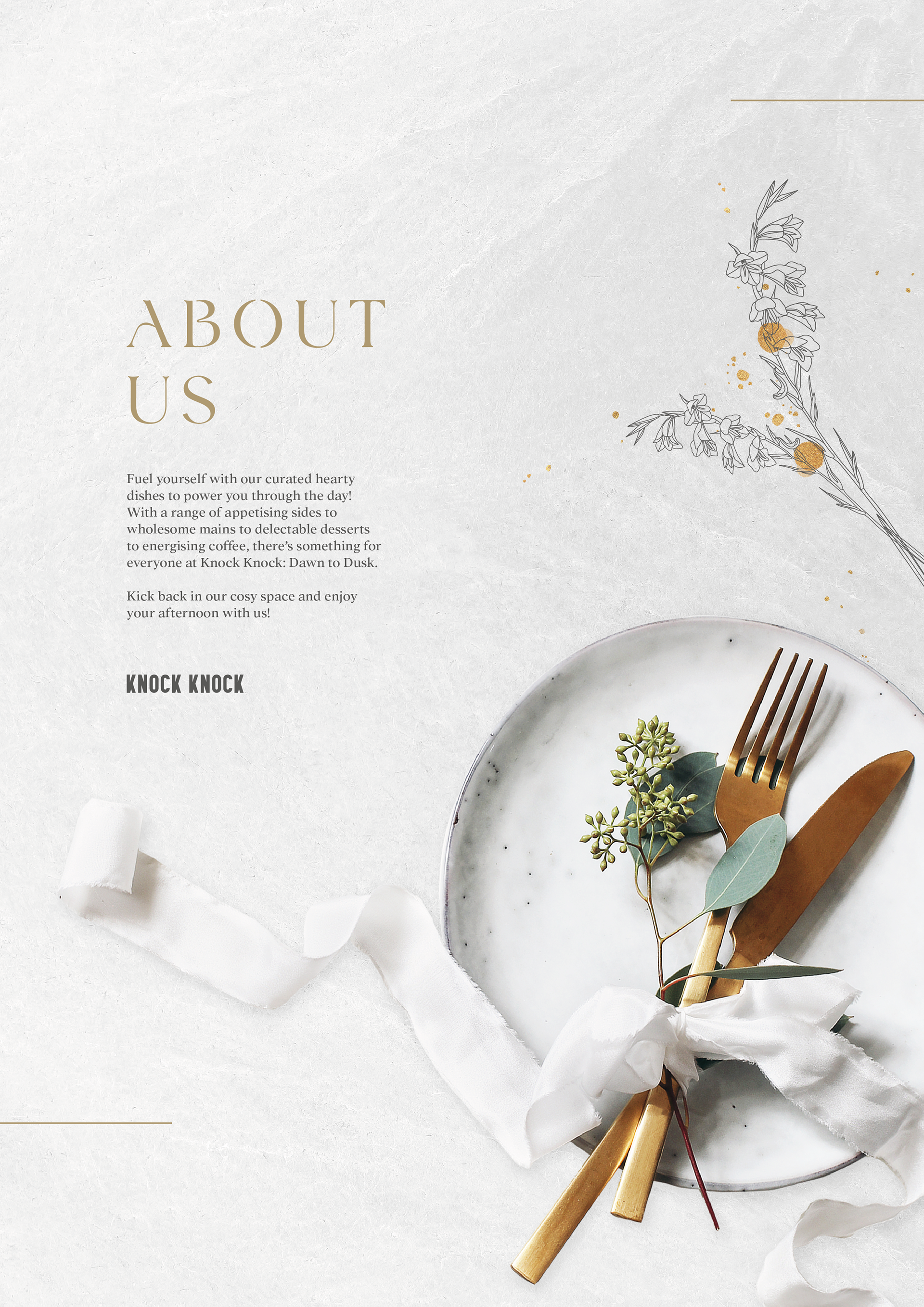
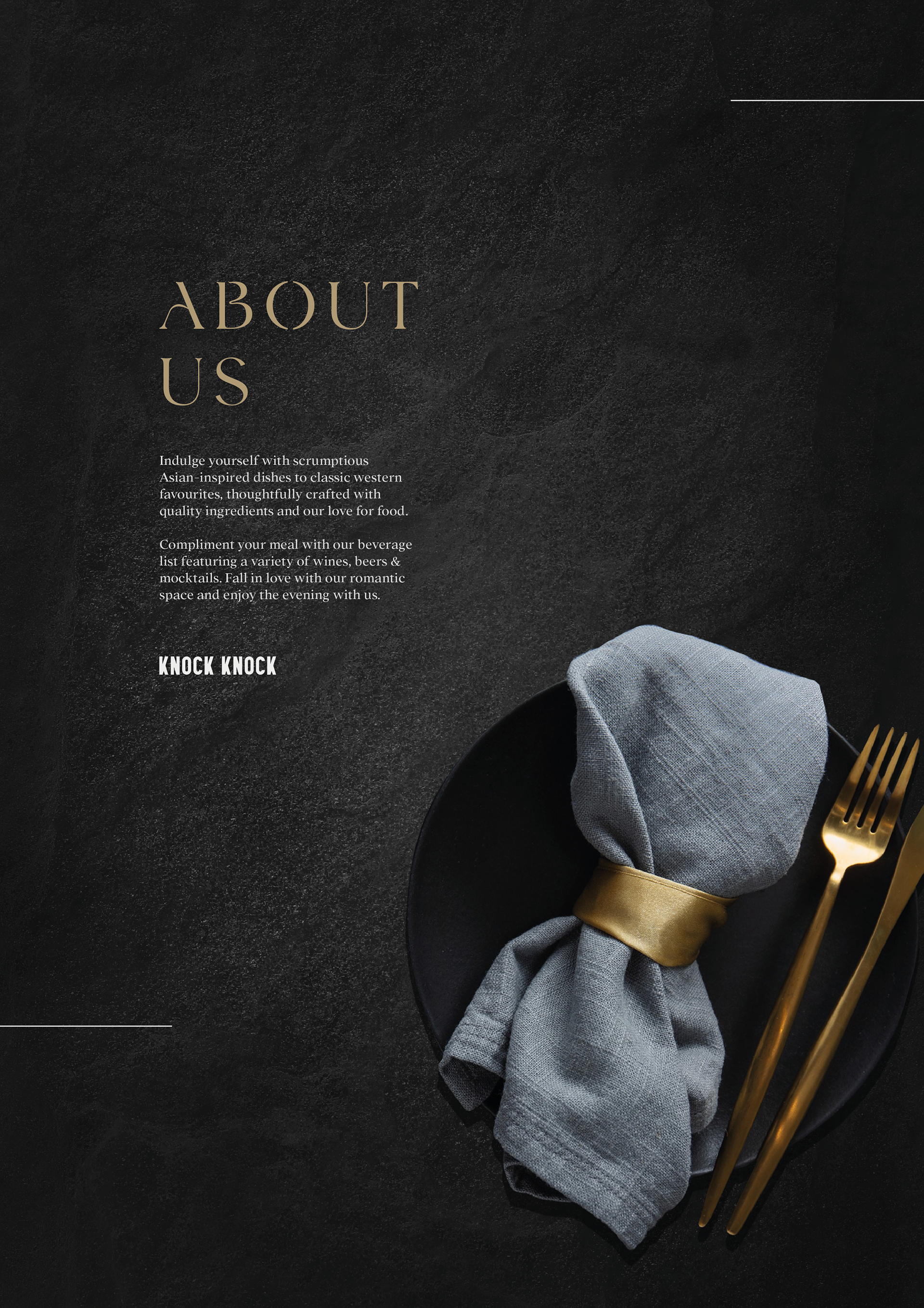
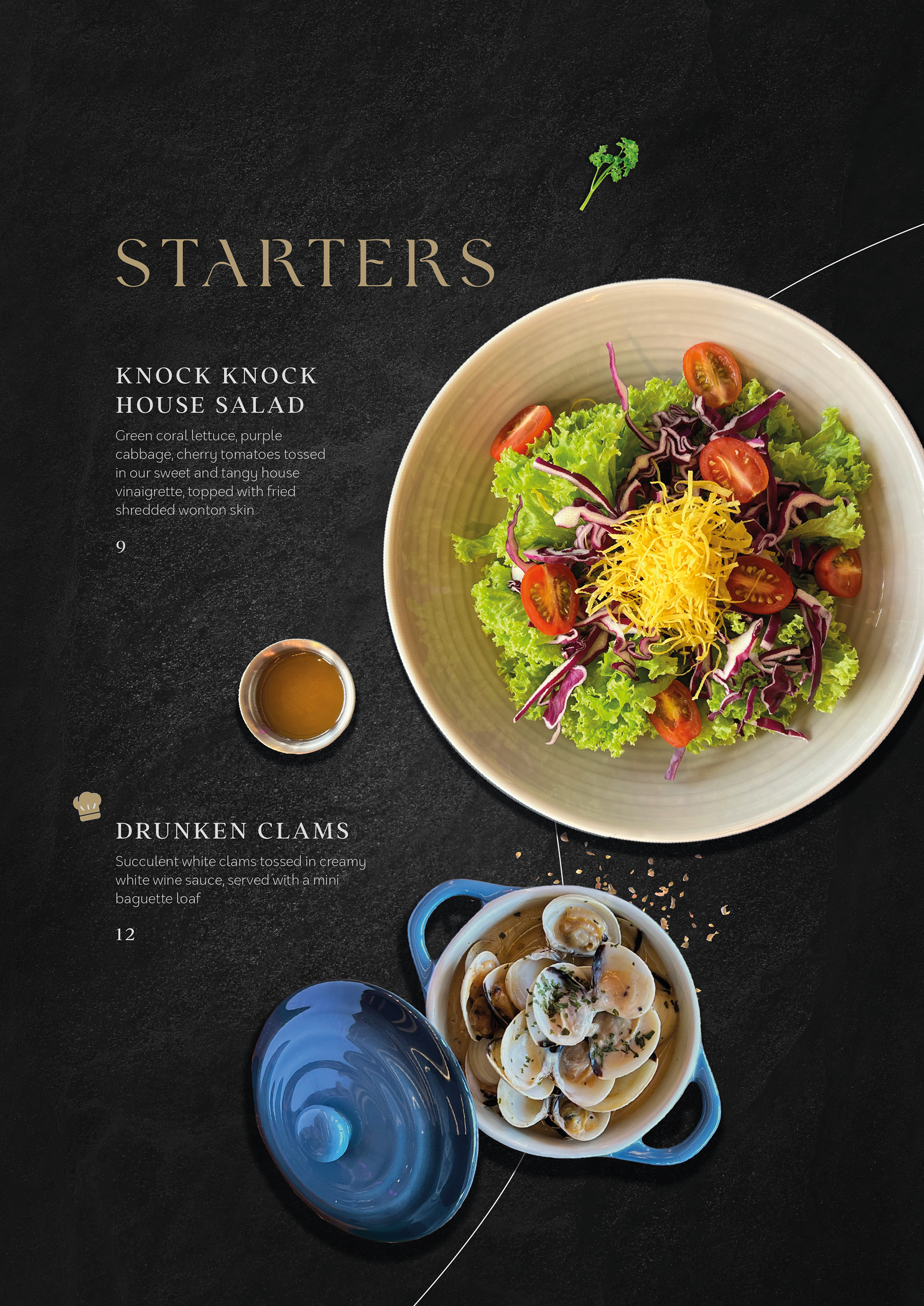
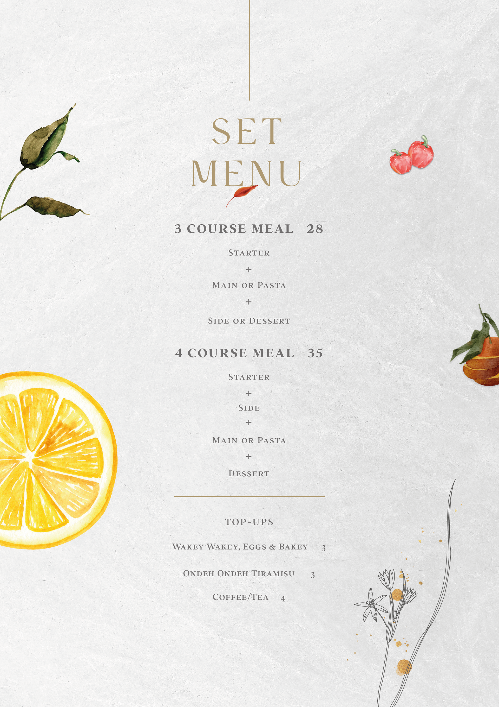
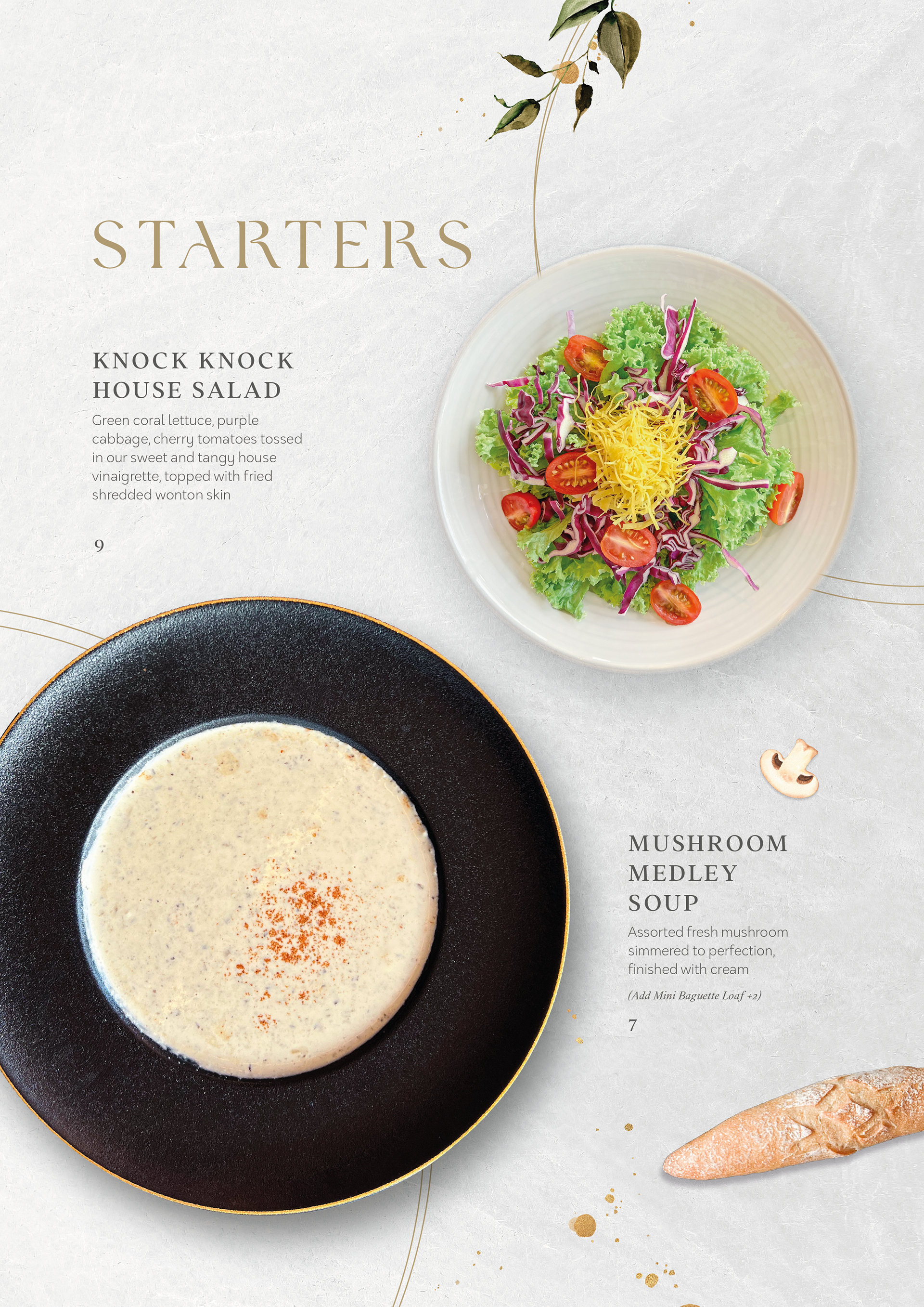
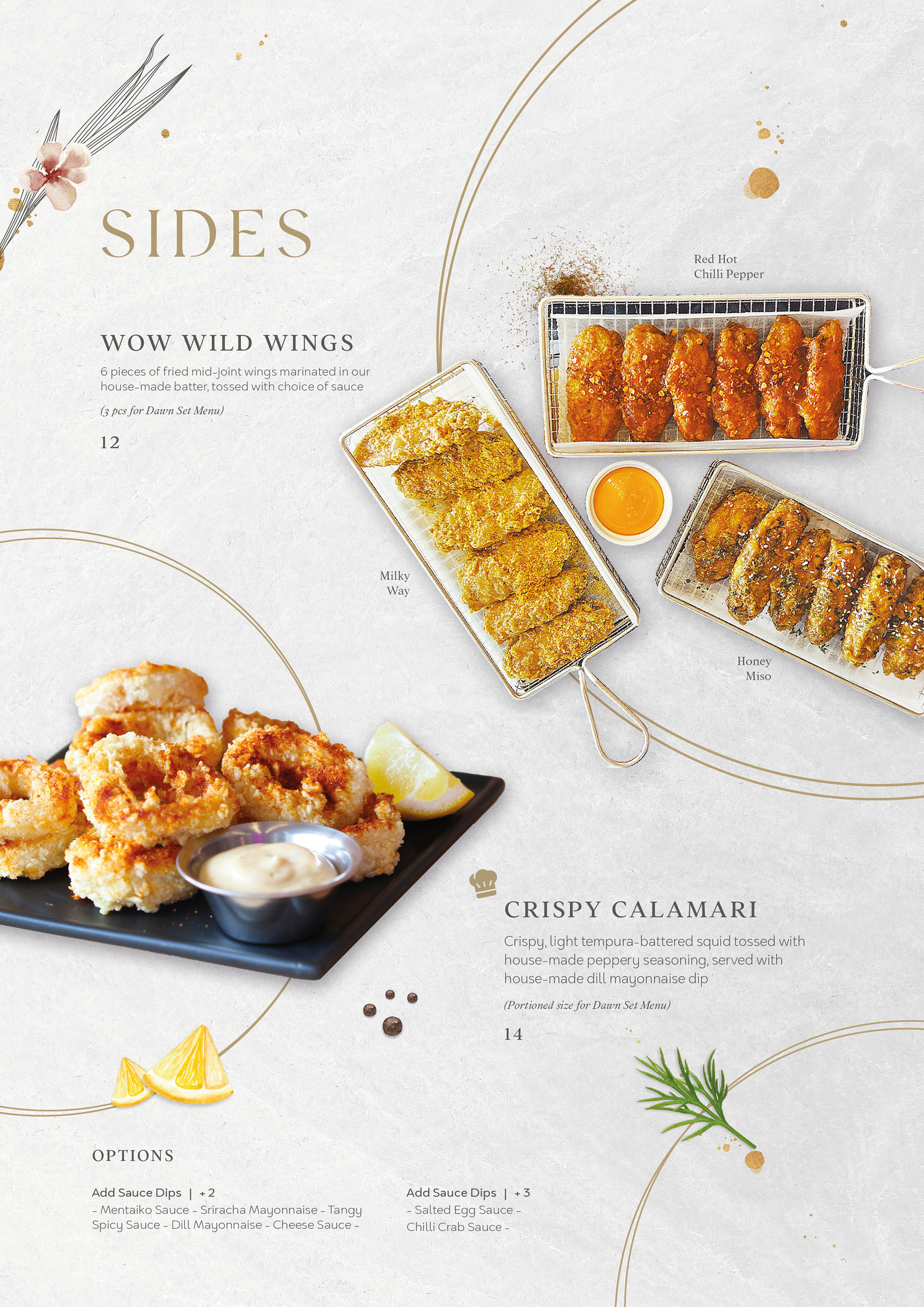
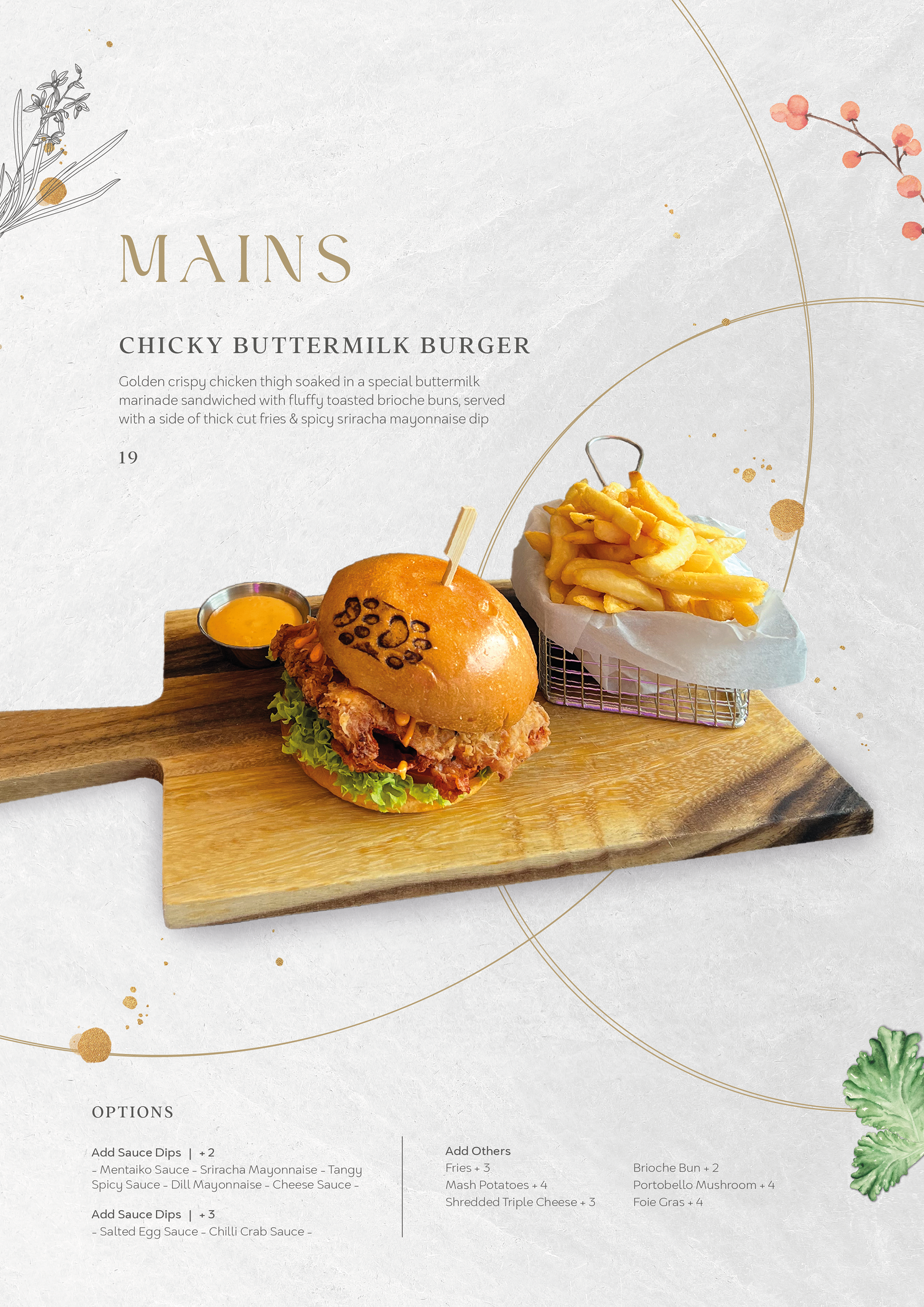
MENUS, TABLE STANDEES, VOUCHERs
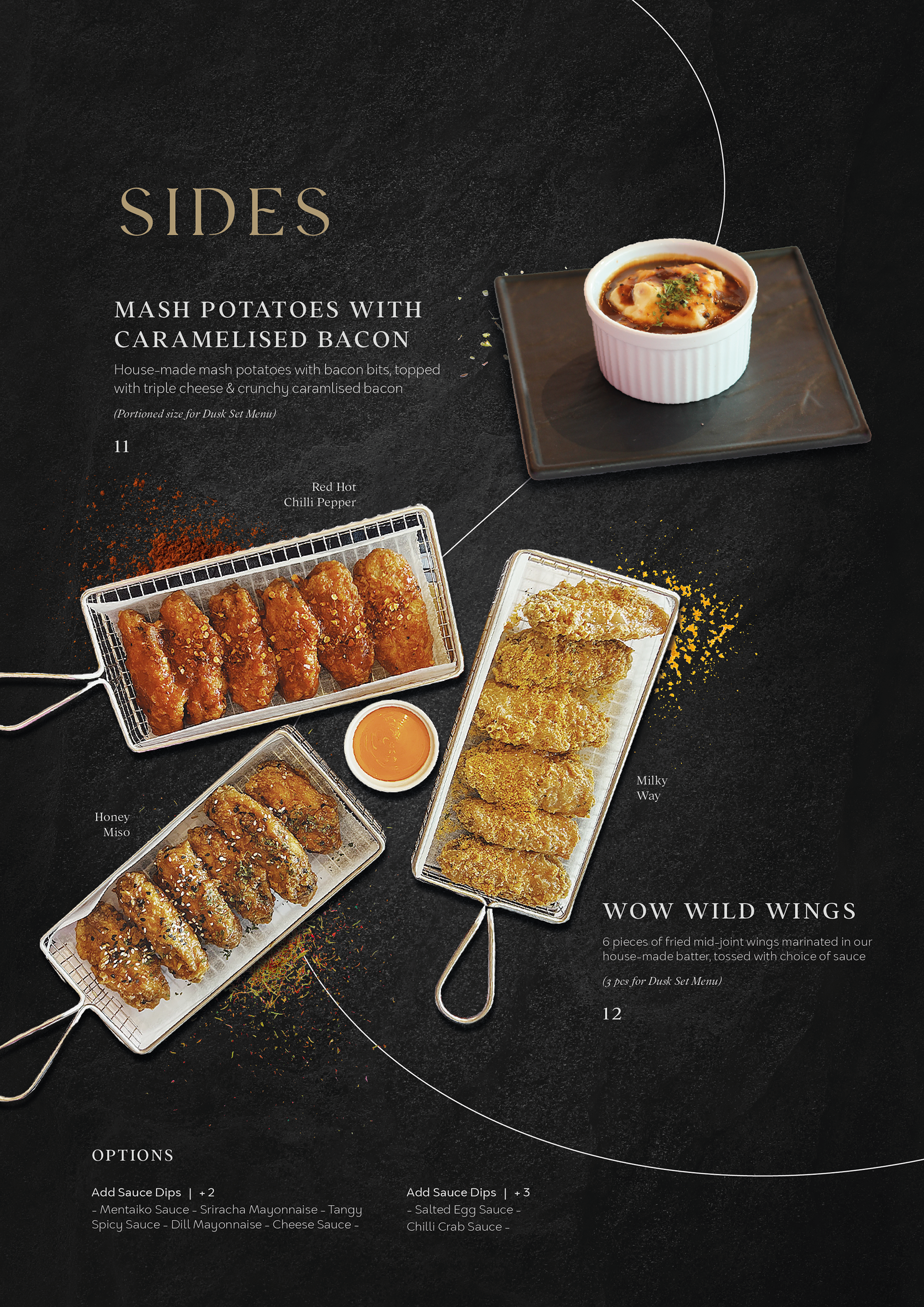
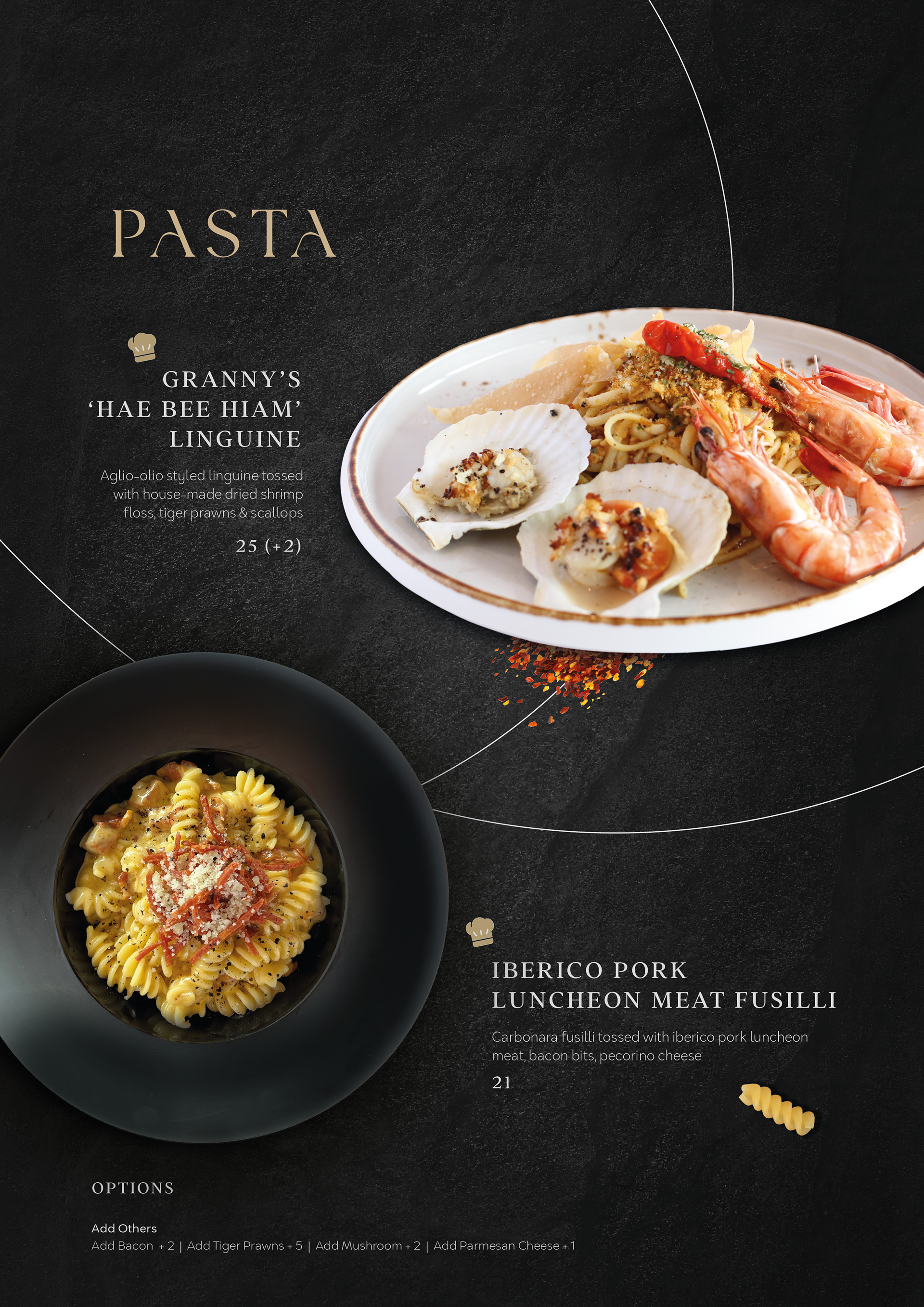
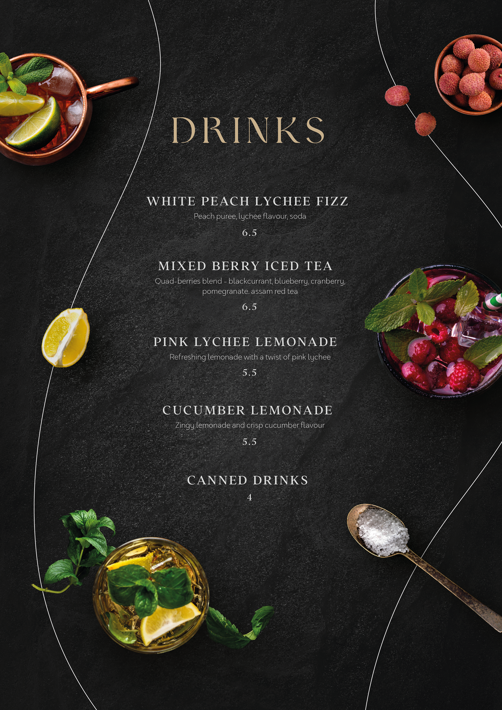
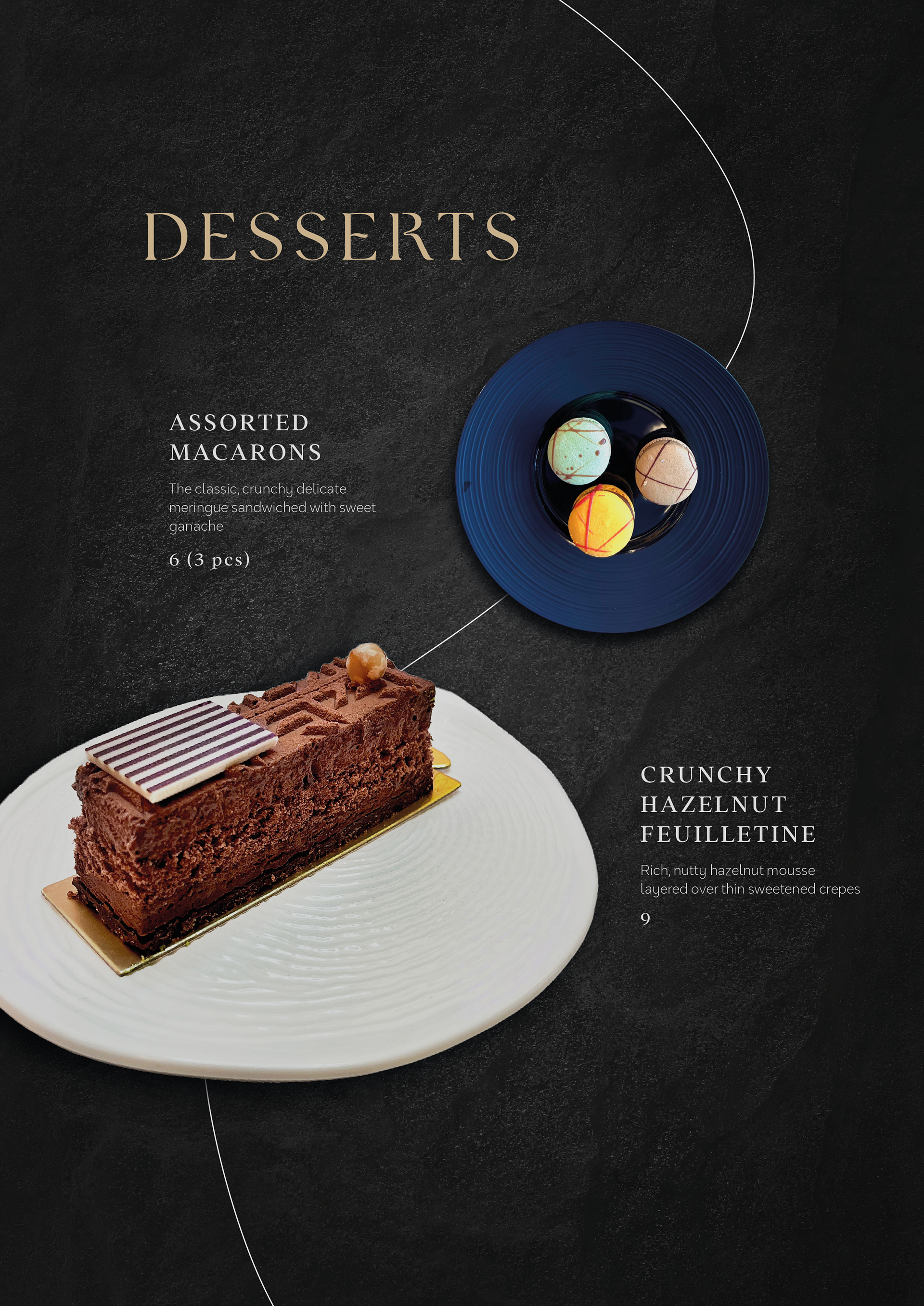
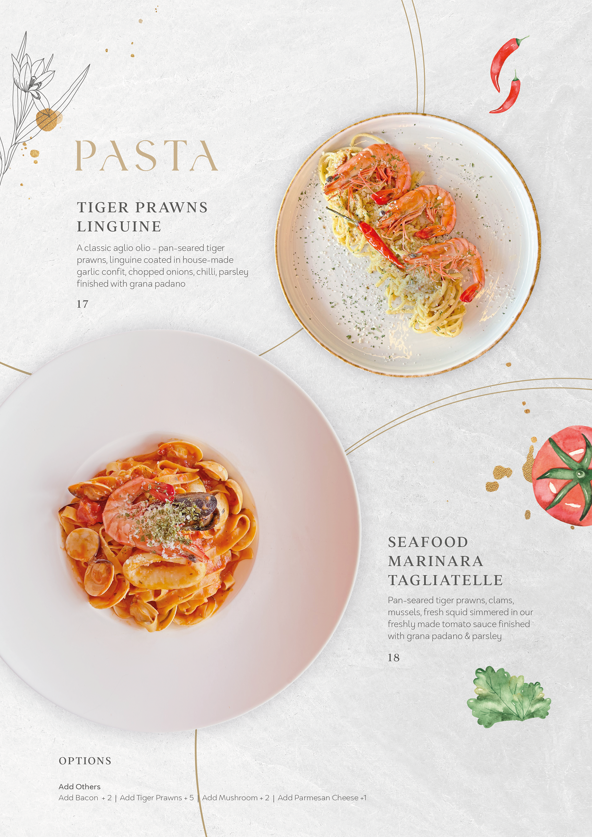
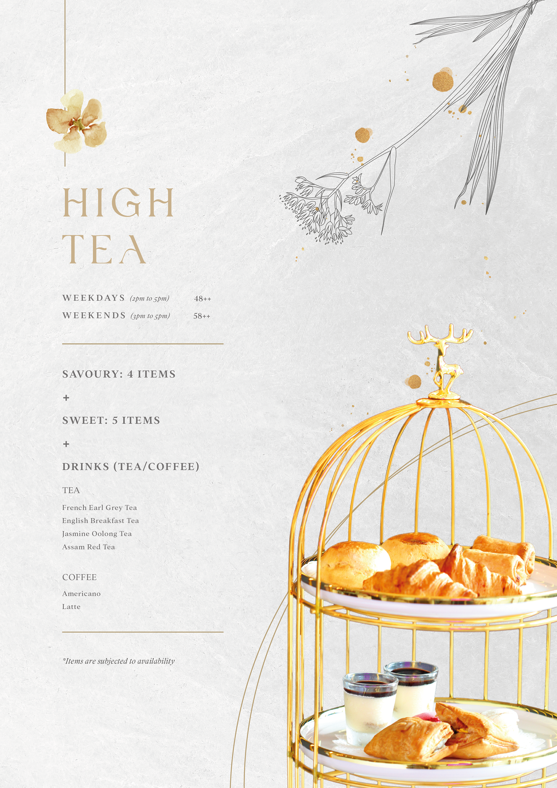
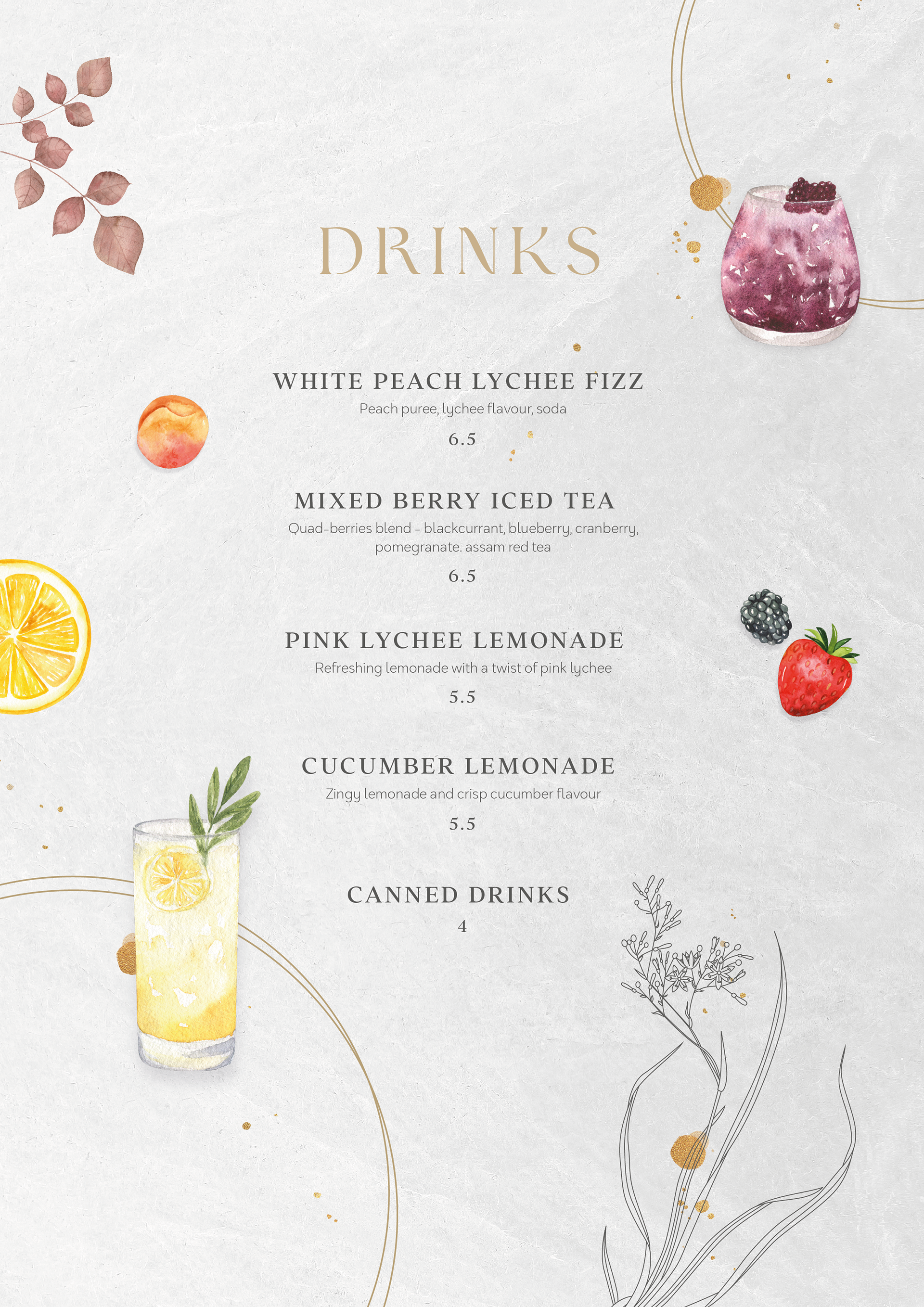
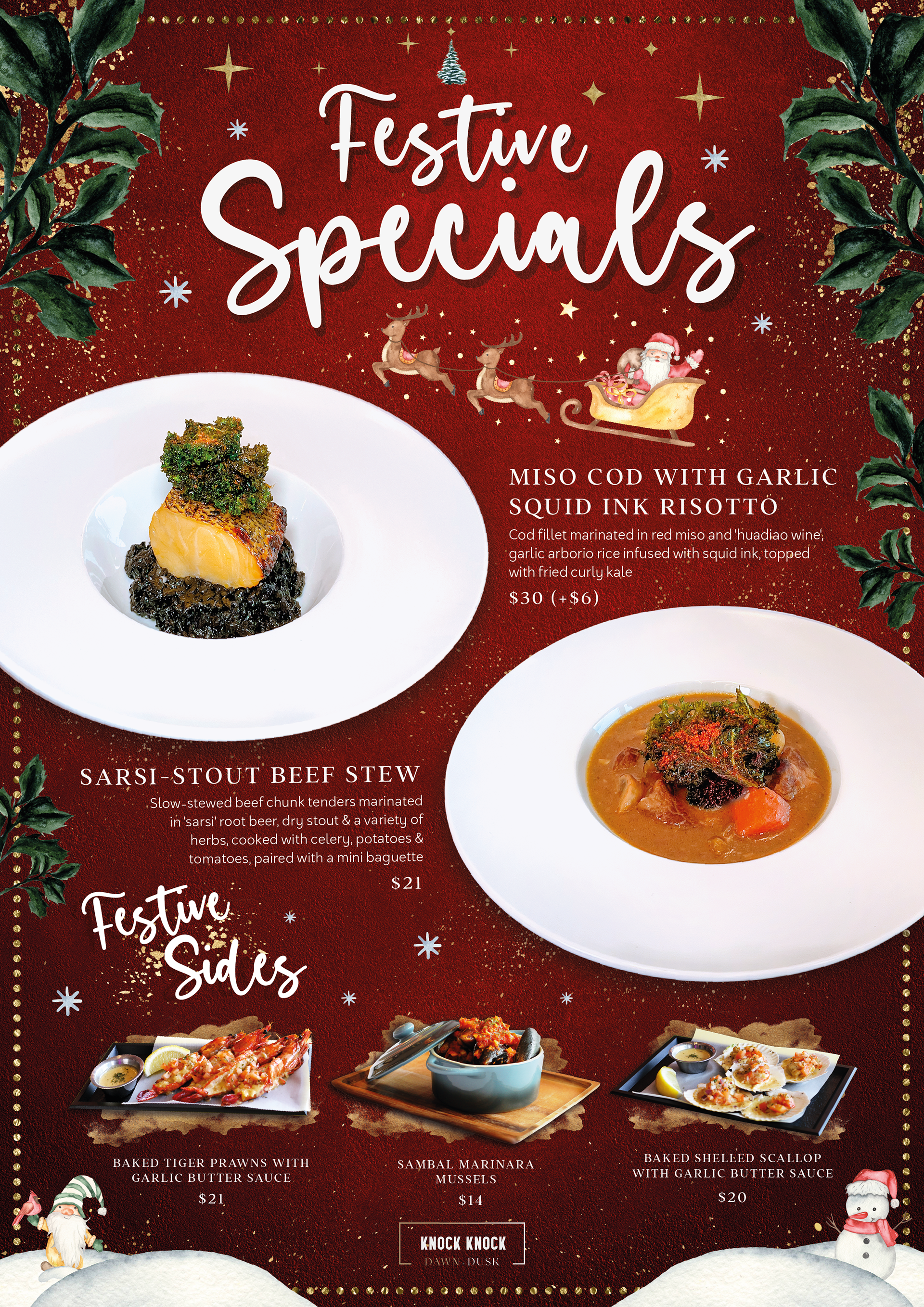
SEASONAL MENUS

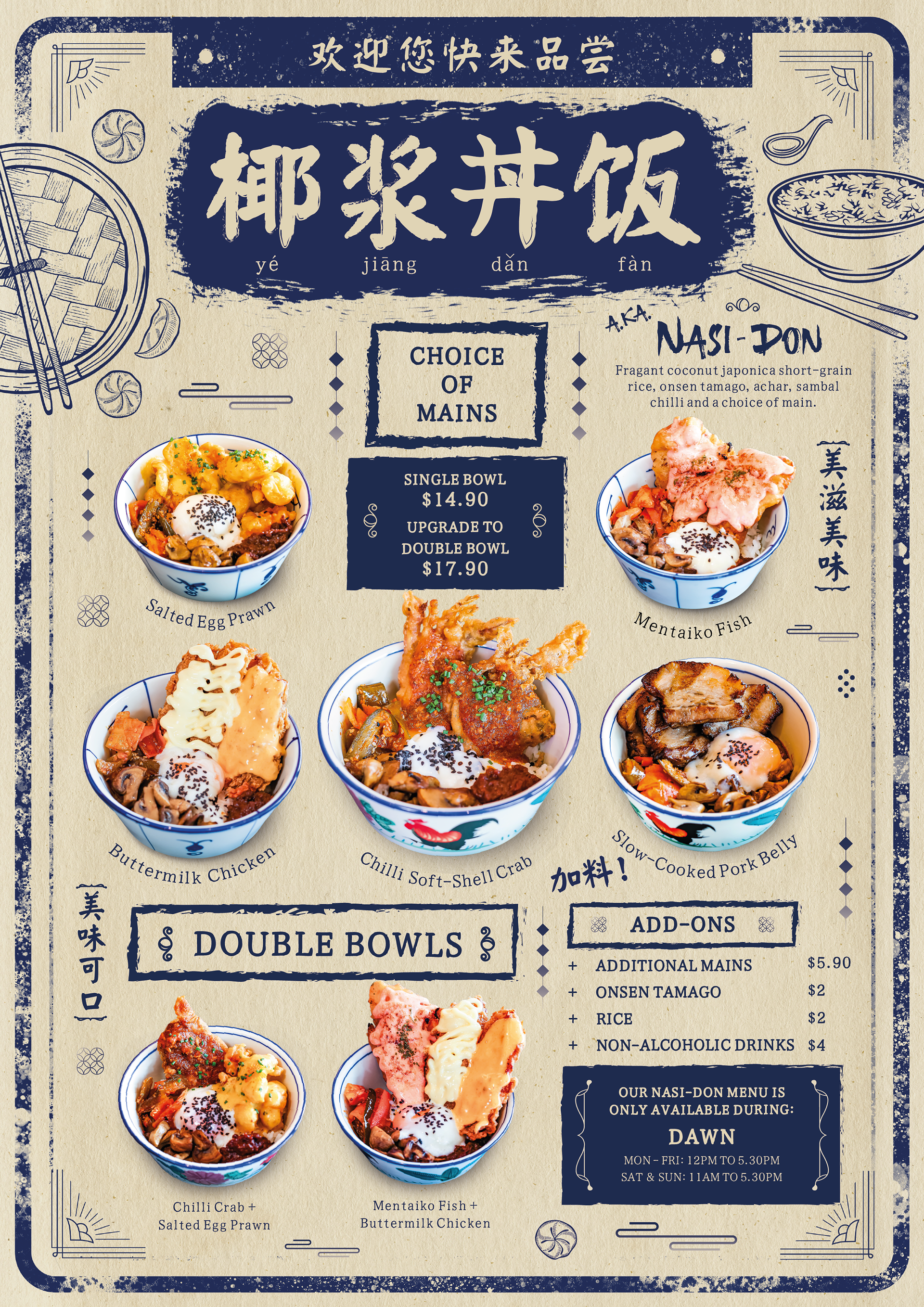
DIGITAL & SOCIAL MEDIA DESIGN
