NATURE'S NUTRITION
CONCEPT FOR ORGANIC TEA PACKAGING
For the final year project of my design diploma, my group and I selected a product from a local supermarket that warranted a redesign of their visual identity and packaging.
I conducted brand and user research, and conceptualised the visuals for the new tea packaging.
School: Singapore Polytechnic, Dip. Visual Communications, 2019 - 2022
Deliverables: Brand Research & Packaging Design
BRAND RESEARCH
SOLUTION
BIG IDEA: Natural ingredients with good intentions
KEY MESSAGE: Nurture health the natural way
ART DIRECTION: To capture the lightness and transformative powers of tea
PACKAGING REDESIGN - ILLUSTRATIONS
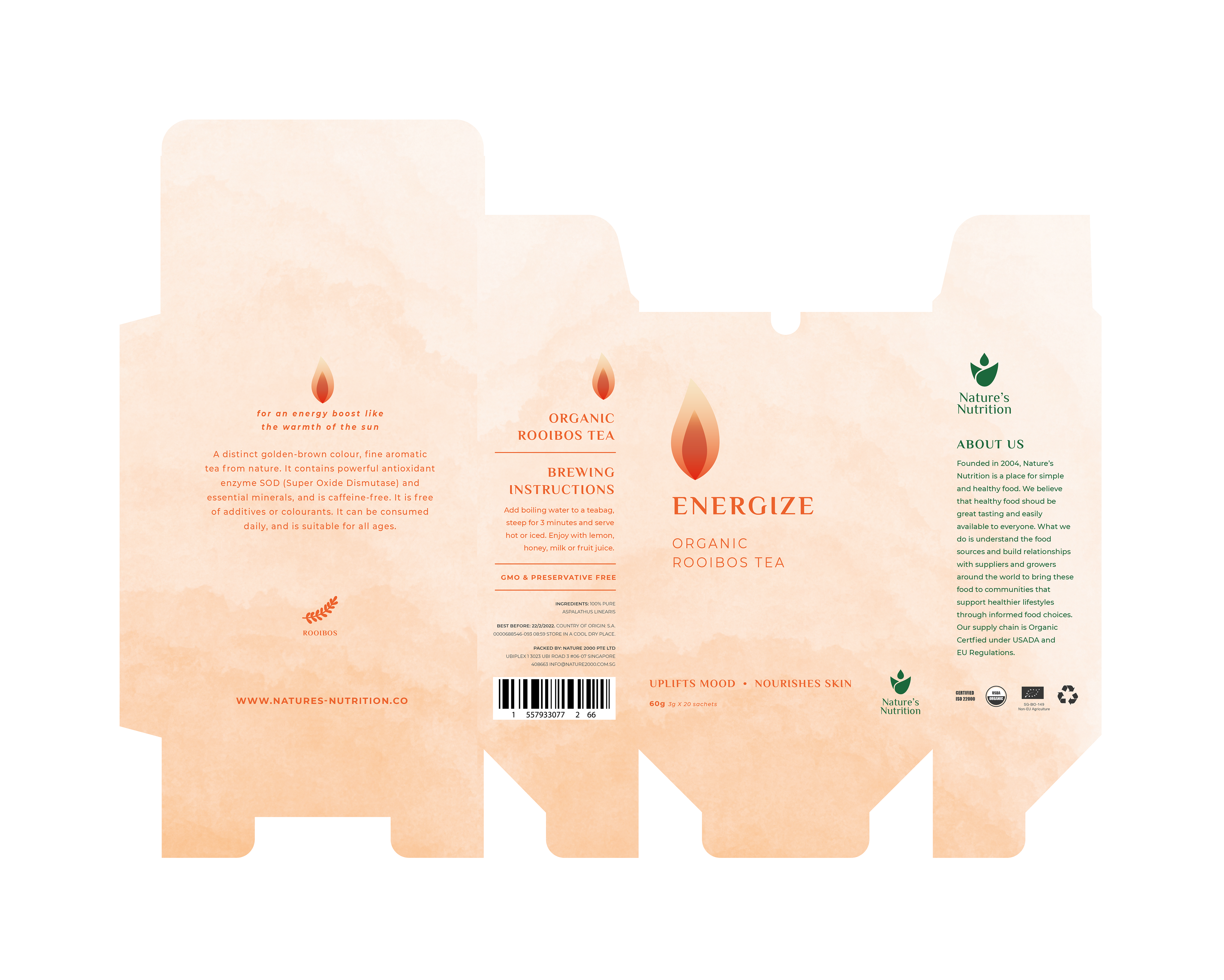
ENERGIZE: Energy emanating from the body's energy centres (chakras)
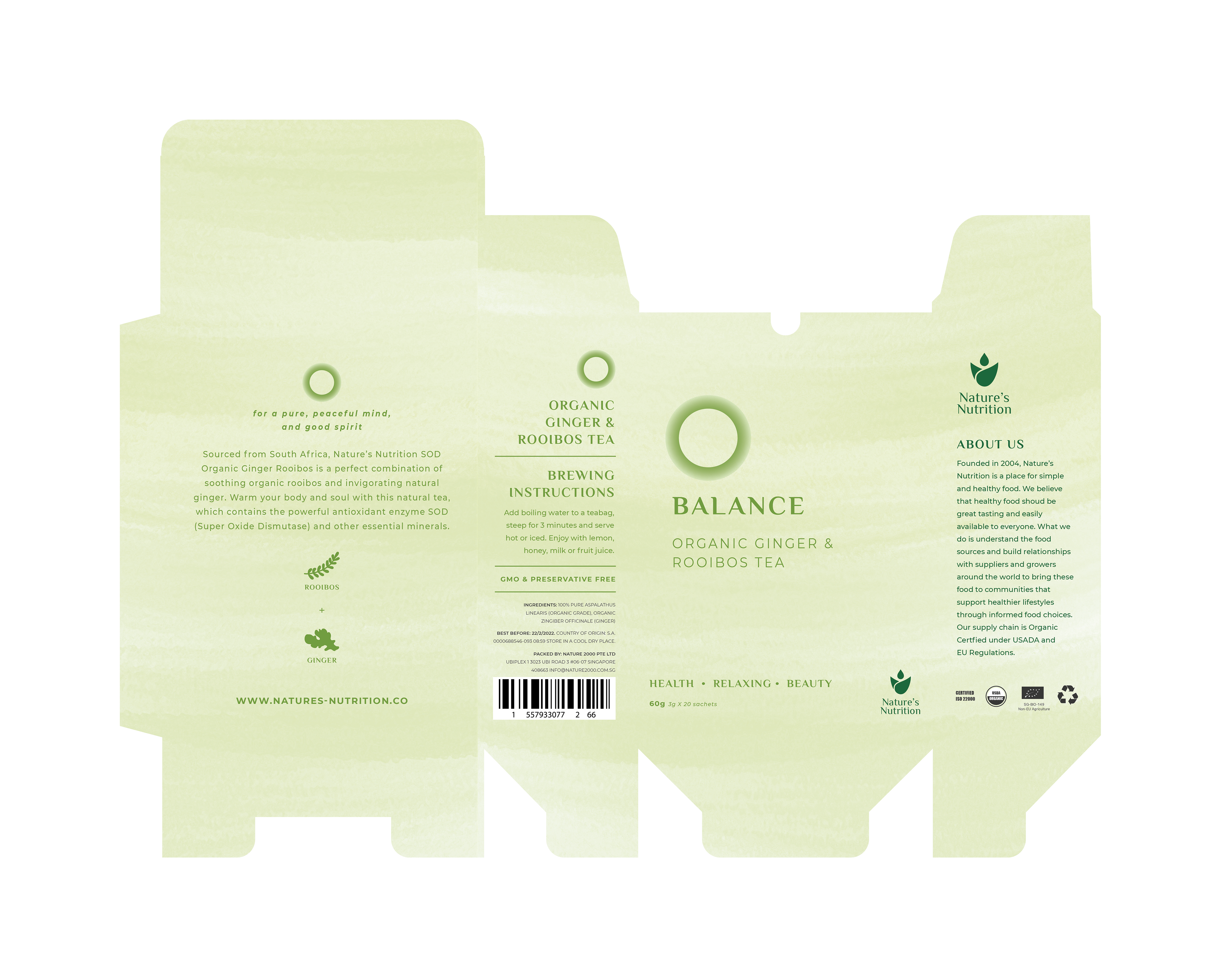
BALANCE: A peaceful landscape of endless gently rolling hills in the countryside
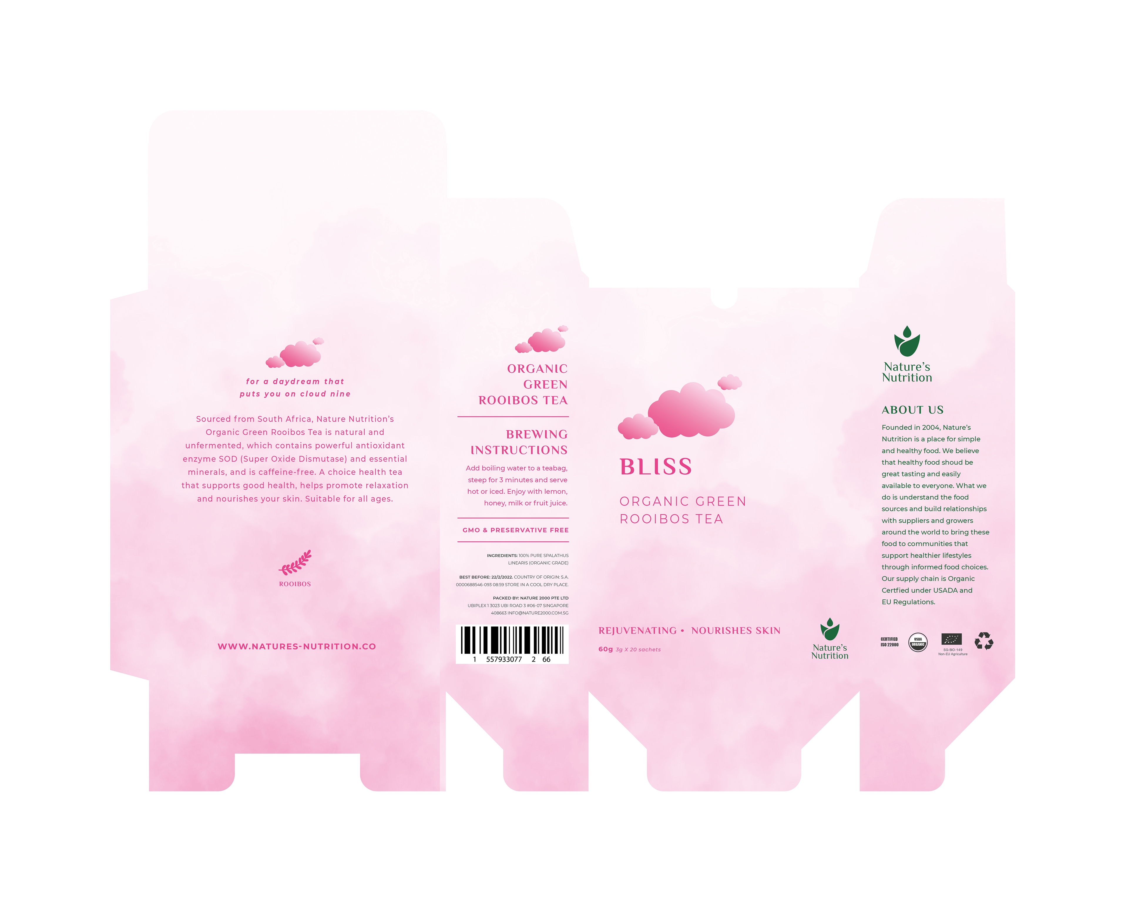
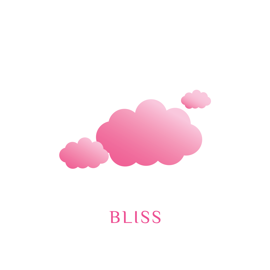
BLISS: The feelings of warmth and joy from love and nurturance
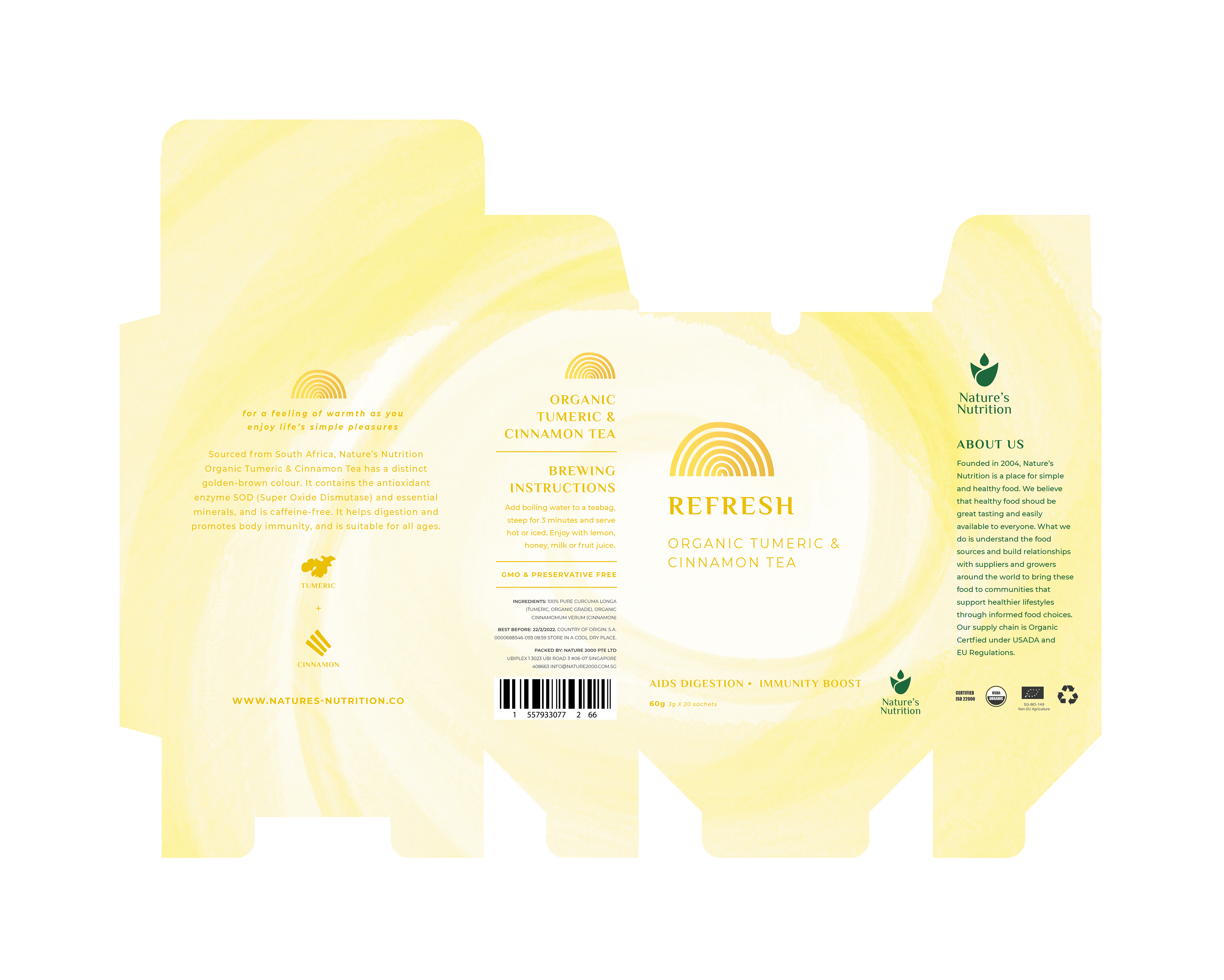
REFRESH: The image of an energy vortex
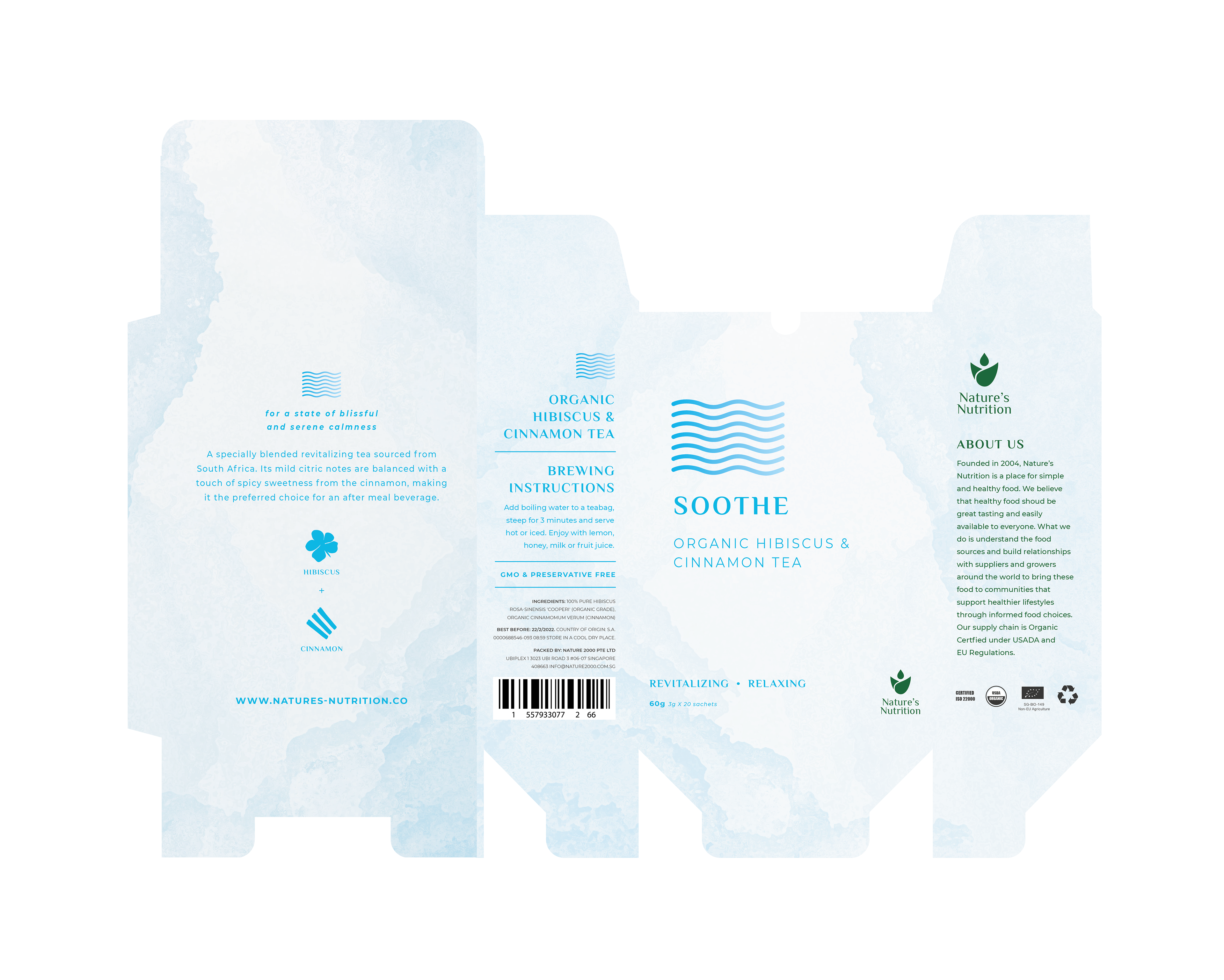
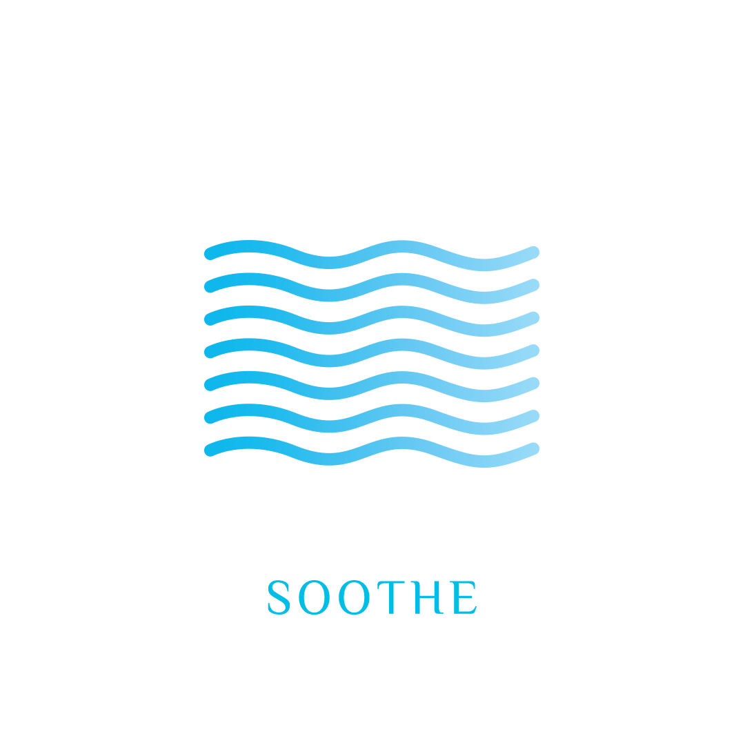
SOOTHE: Calming and embracing protectiveness of a woman's womb
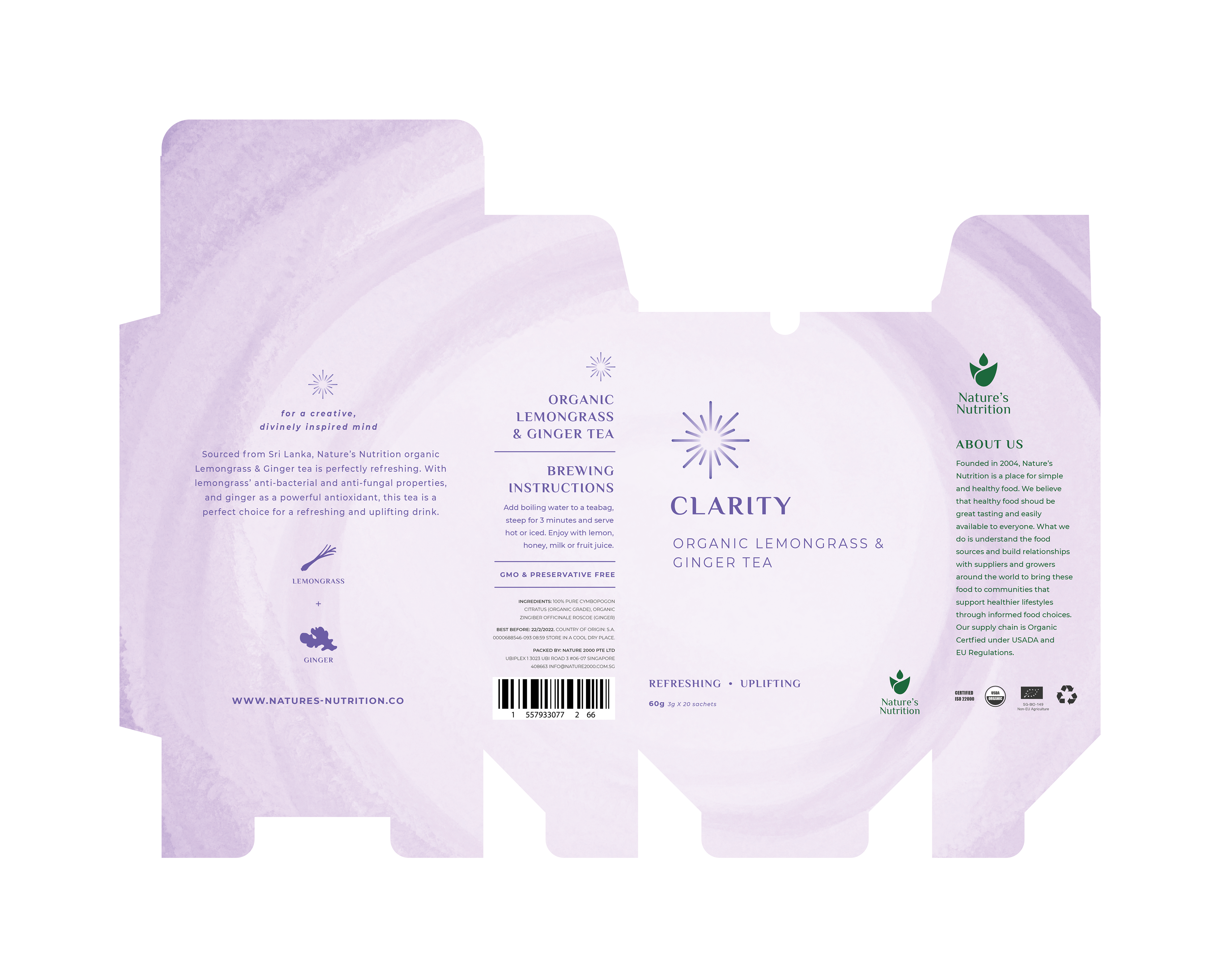
CLARITY: The sensation of a uncluttered mind






PACKAGING REDESIGN - ICONS
The icons are a visual description for the names of the tea, which are derived from the effects of the tea ingredients. Pastel shades were used for the illustrations for their lightness and brightness, which reflects the quality of brewed tea.




PACKAGING MOCKUPS
