NASI DON
JAPANESE DONBURI
I created a visual identity for a Japanese Donburi outlet. The brief was to create an energetic and attention-grabbing visual identity. The final concept shown below incorporates the energy and intensity inherent in the visuals of Japanese manga to exude a passionate celebration of culinary creations.
Client: LUXE SG HOLDINGS
Industry: Food & Beverage
ABOUT THE LOGO
red circular brush stroke
• Resembles flames around a hawker's wok
• Representing passion that goes into creating creating each bowl of Nasi Don.
black Chinese characters
• Resembles Chinese characters drawn in ink calligraphy
• Communicates refinement and artistry behind Nasi Don.
TYPOGRAPHY
REEJI-CHAO-XIAOSHIGB
• Calligraphic look for Chinese characters
• Projects artistry and skill
Shinryusou
• Handwritten look ties in with the craftsmanship ethos of Nasi Don
• Has good legibility at small font sizes
SHIKAMARU
• Gives off an energetic mood
• Broad letters reminiscent of Japanese kanji
TEKO
• Bold, loud and angular
• An impactful typeface with good legibility at small font sizes
ZHSCNMT - GBK
• Good legibility at small font sizes
• Angular appearance and consistent thickness in the strokes of the Chinese characters
COLOUR PALETTE
RED: Passion
BLACK and WHITE: Boldness and confidence
YELLOW: Energy and enthusiasm
ACCOMPANYING GRAPHICS
grunge texture
• Created with comic sunburst speed lines
• Rough texture and outwardly radiating lines gives off an impression of raw energy
• Used for the backgrounds of collaterals or signages
Brush strokes and hanD-drawn lines
• Conveys handcrafted nature into the brand collaterals
• The circular dotted line is derived from a signage style with a single Chinese character in each circular frame.
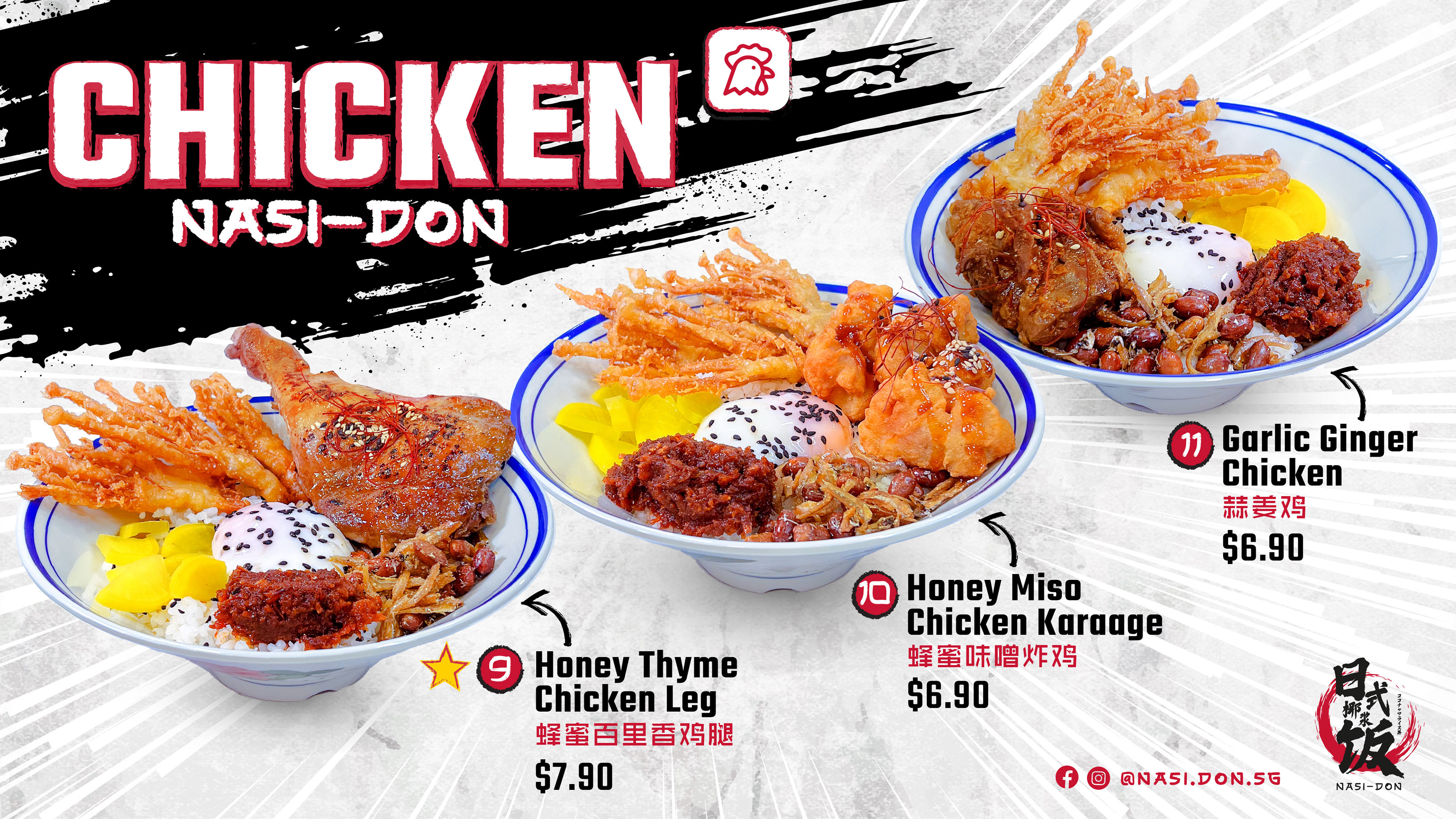
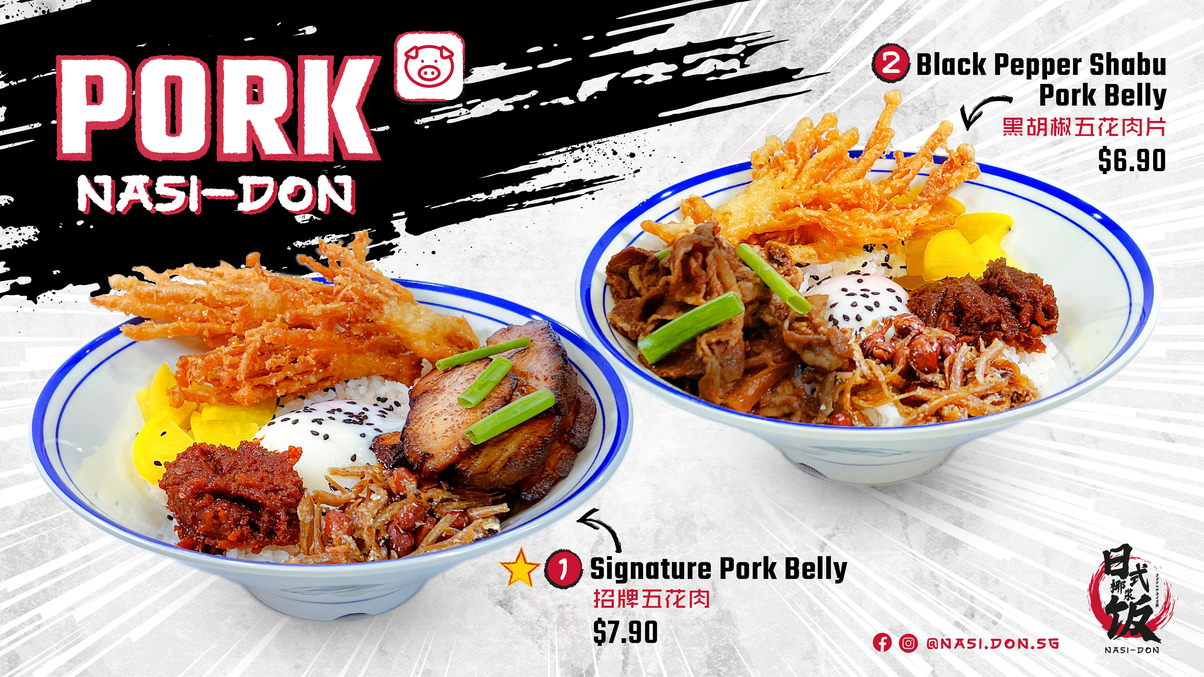
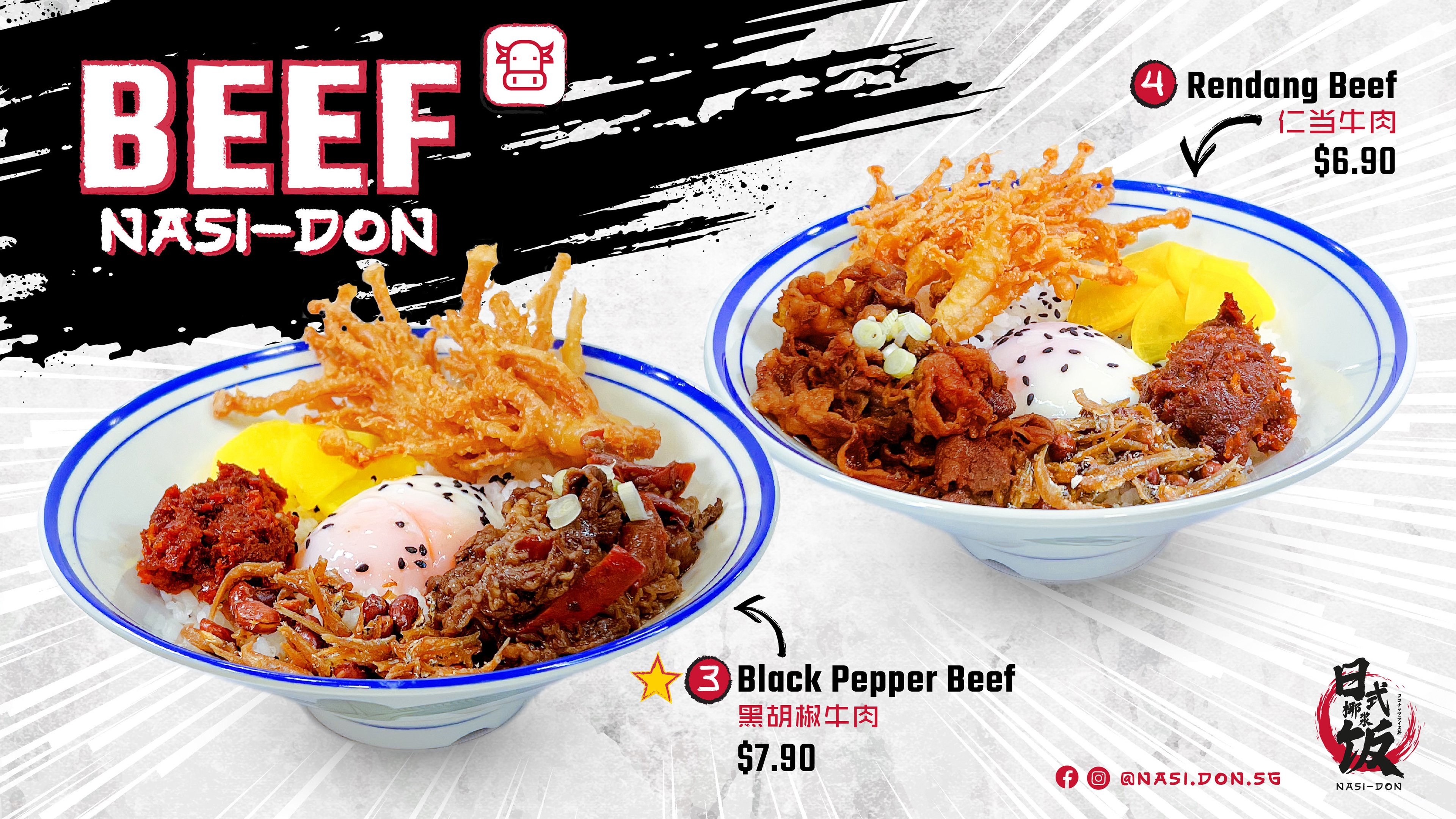
MENU & SIGNAGE DESIGN
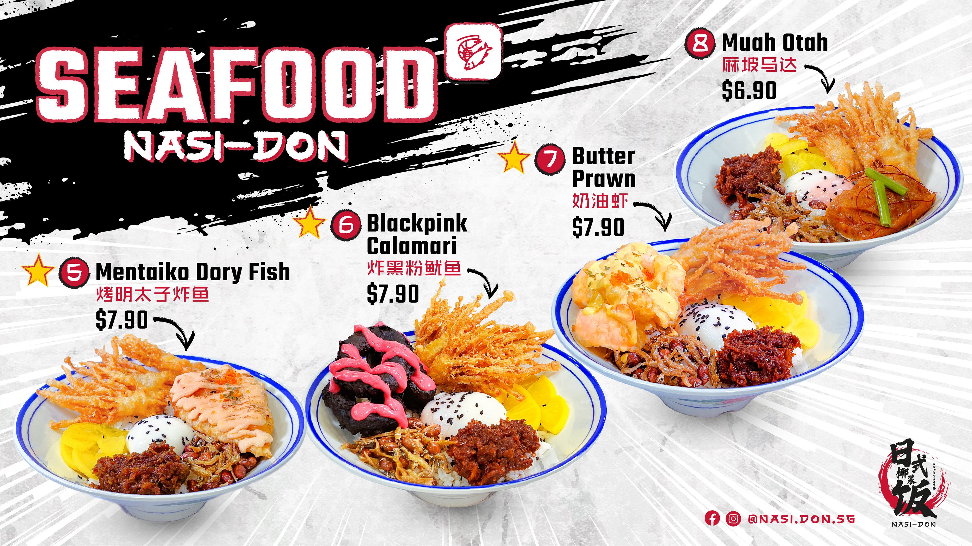
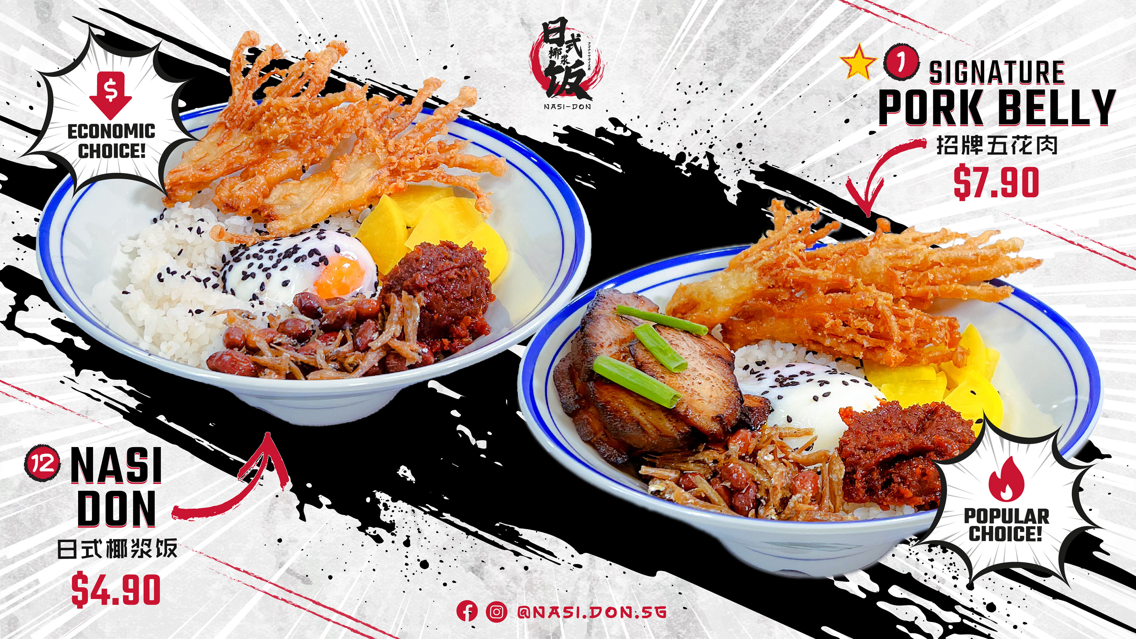
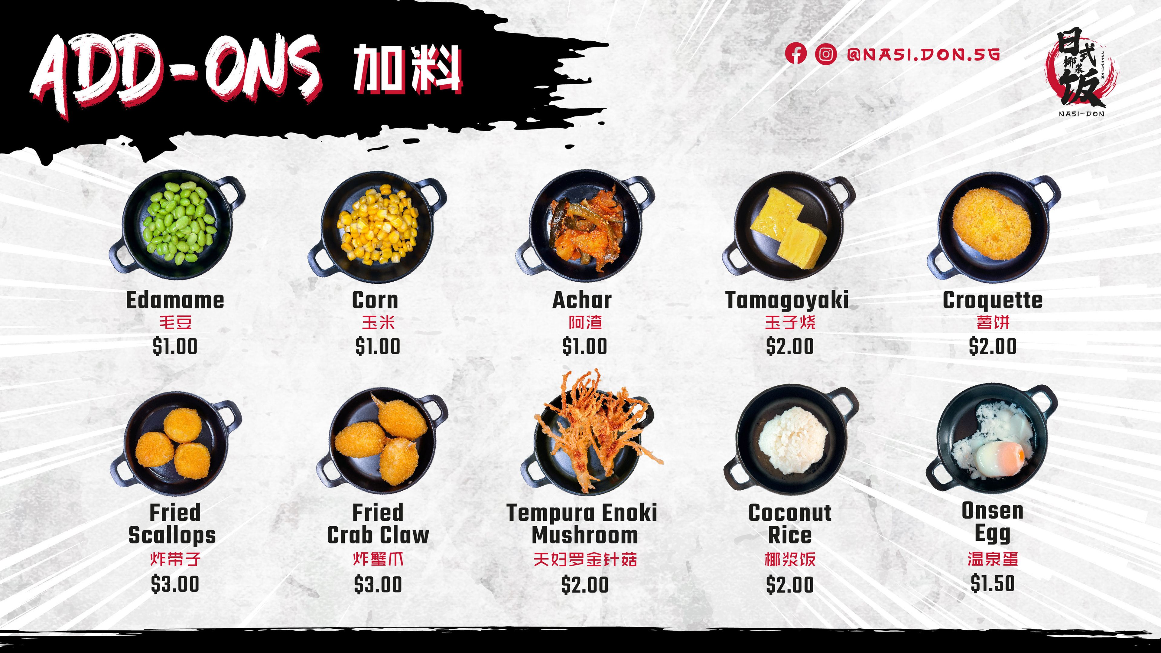
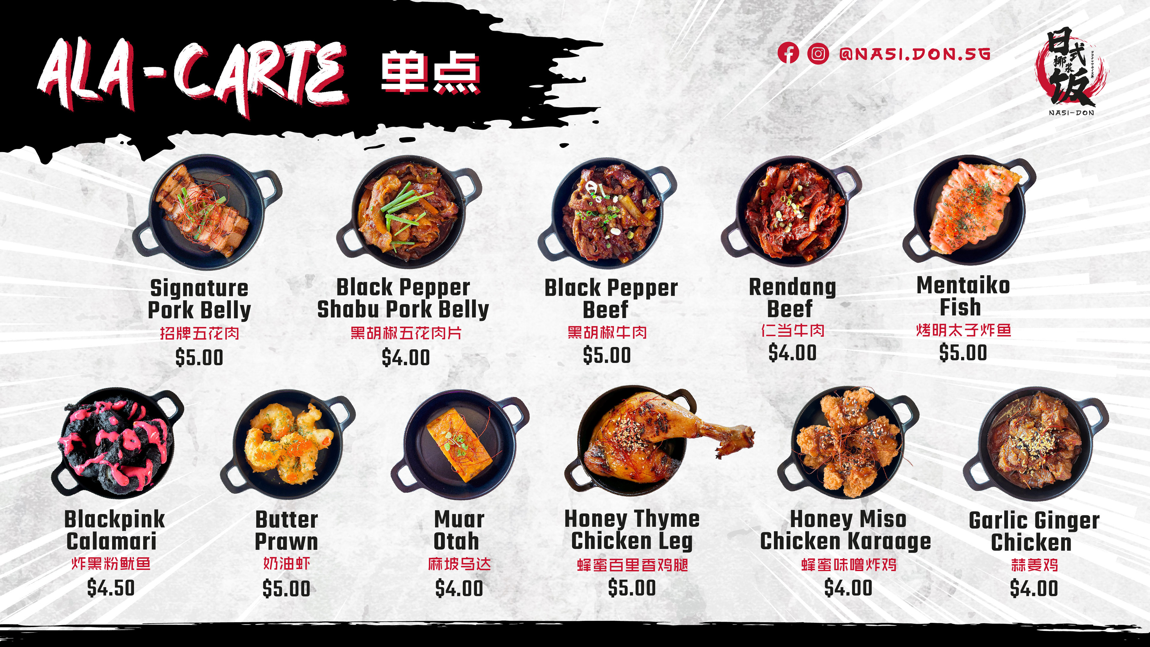
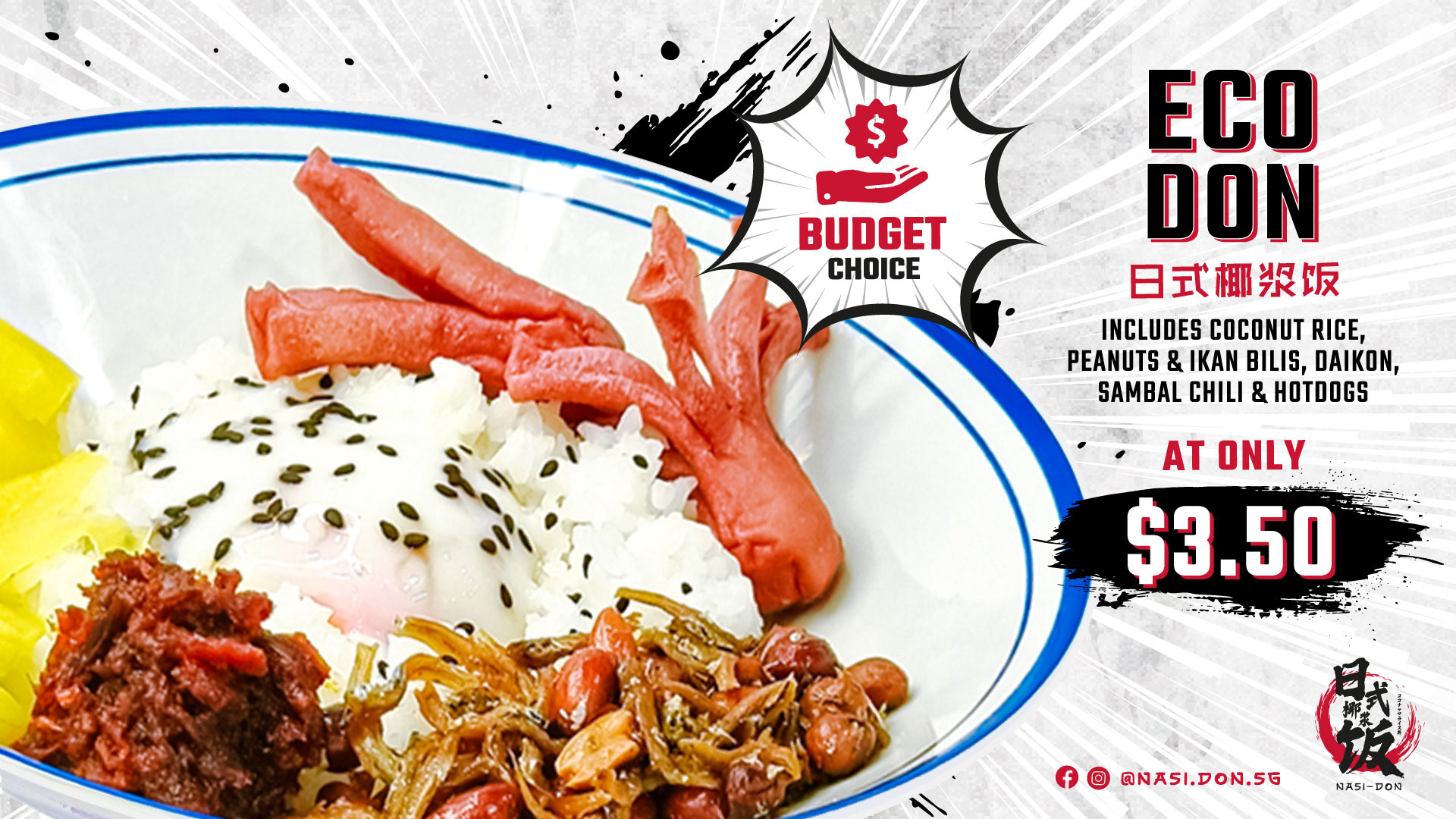
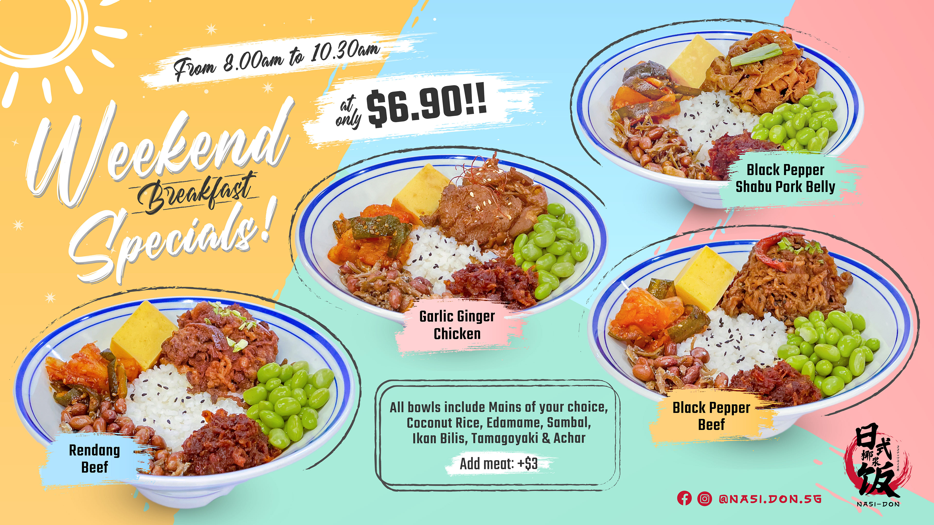
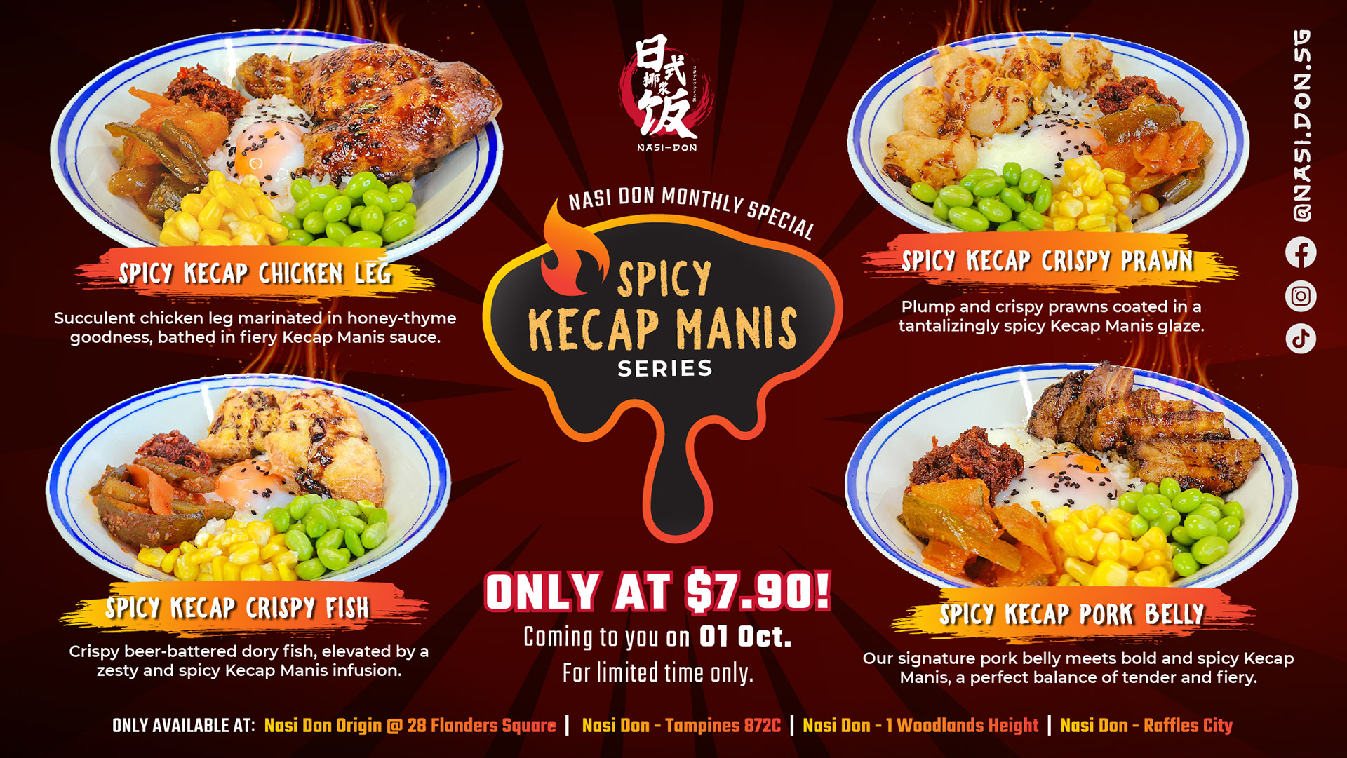
GRAPHICS FOR TV DISPLAYS
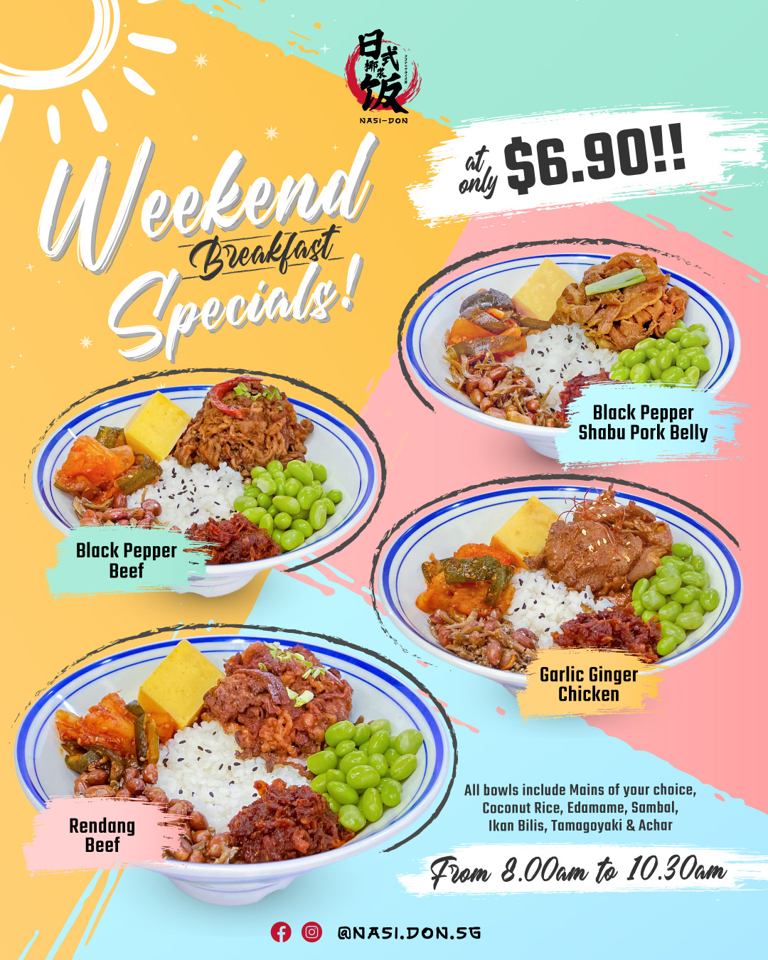
INSTAGRAM POSTS
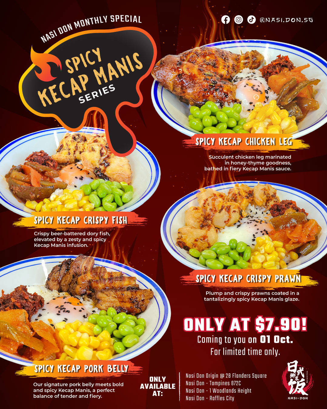
FLYER DESIGN
