SEVENTH HEAVEN
CONCEPT FOR A WELLNESS-FOCUSED CAFE
Seventh Heaven is a welcoming, minimalist and meditative space serving as a physical, emotional and mental retreat for individuals. This visual identity is designed to reflect an image of quietness and simplicity.
School: Singapore Polytechnic, Dip. Visual Communications, 2019 - 2022
Deliverables: Brand Identity & Brand Guidelines
ABOUT THE LOGO
CONCEPT: A GUIDING STAR
The logo mark's pyramidal shape and seven loops imitate the silhouette of a starburst and a temple combined, guiding individuals towards a tranquil retreat for the body and mind, giving them hope to function from their most authentic expression, through grounded introspection, free from all the distractions of modern life.
Here are the vertical and horizontal versions of the logo:
COLOUR PALETTE
SKY TURQUOISE: Clarity, expression, a clear and tranquil mind
FOSSIL GREY: Introspection, meditativeness
GRAPHIC SIGNATURE
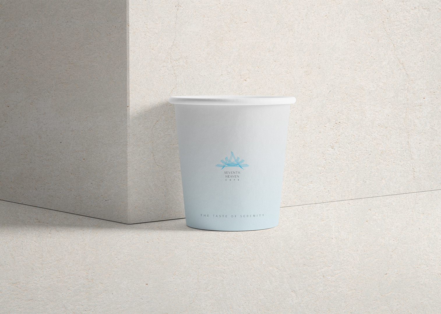
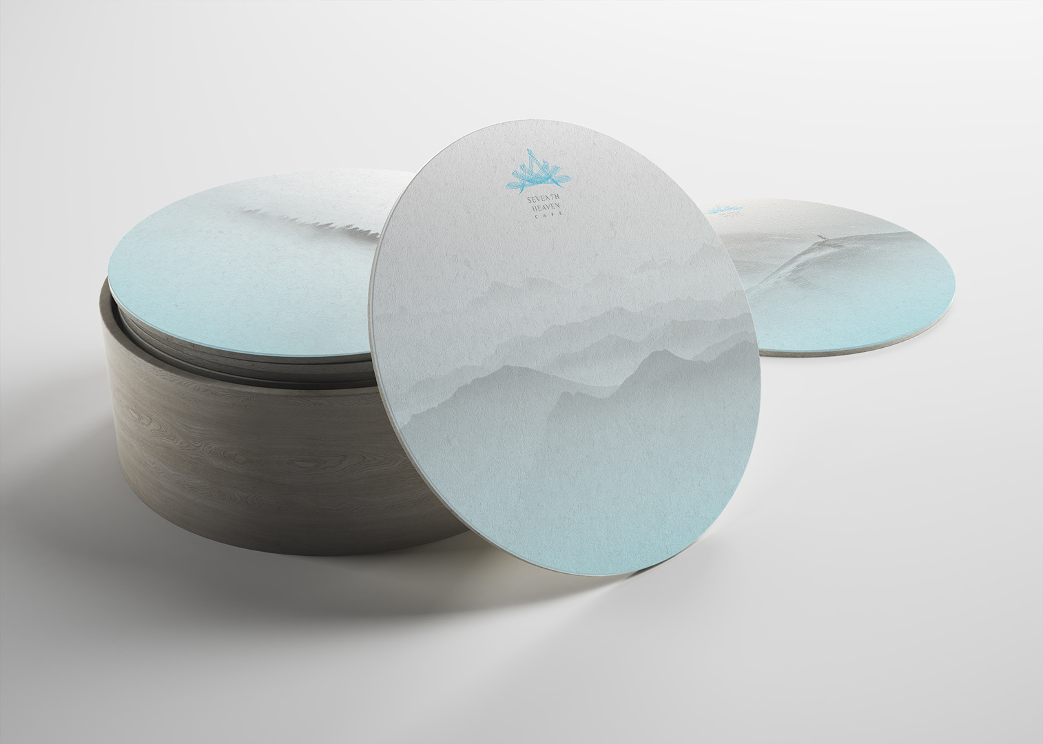
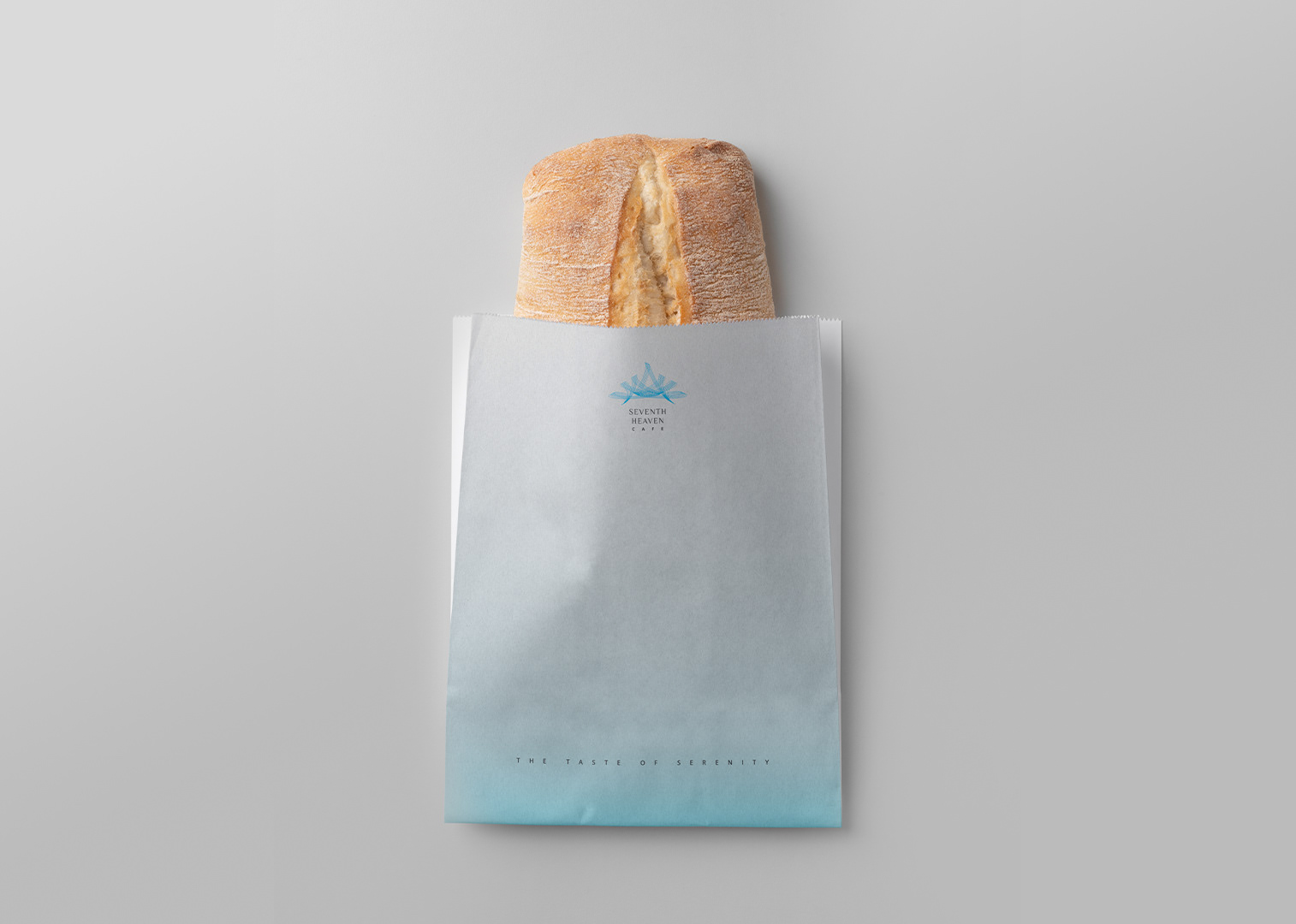
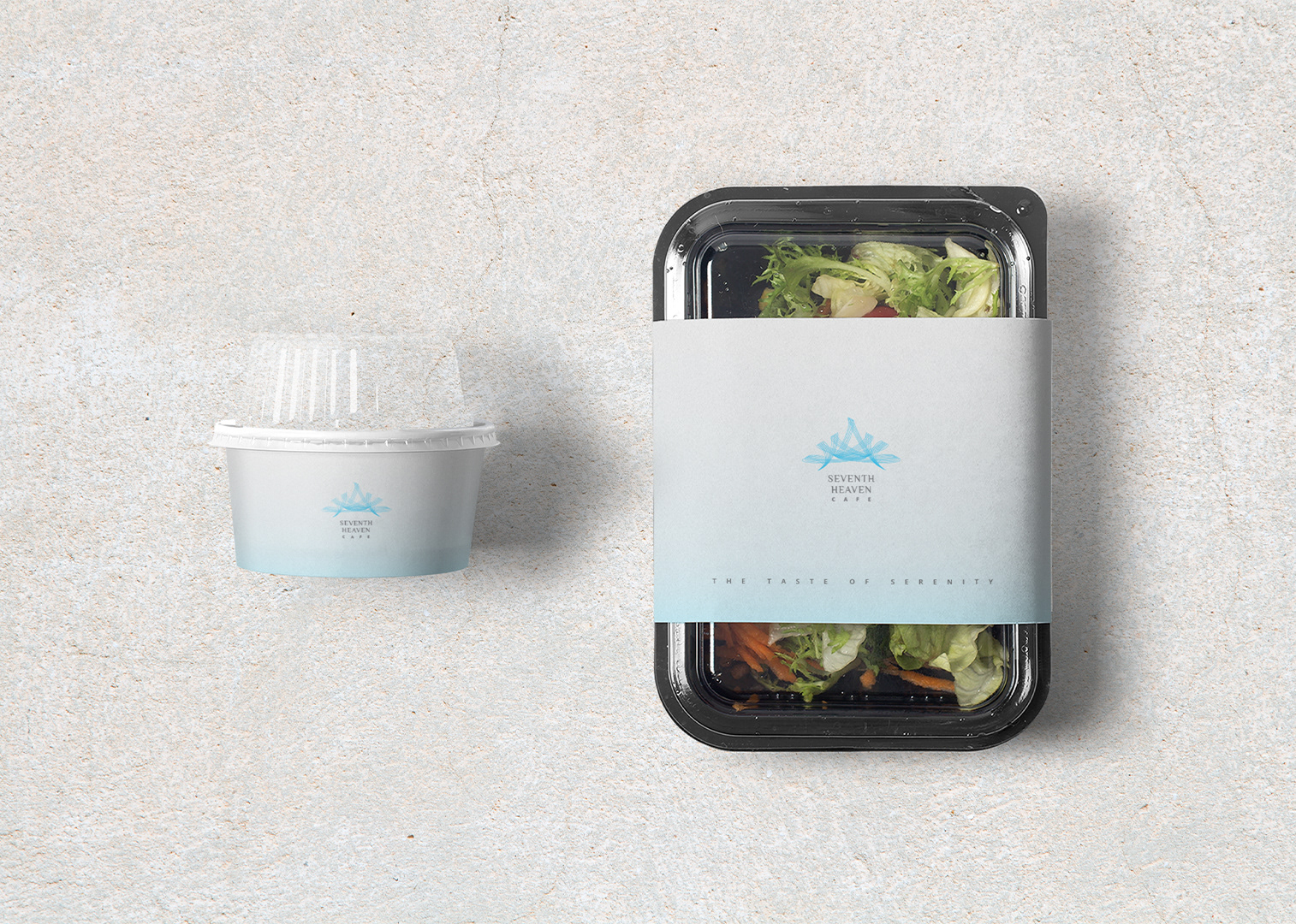
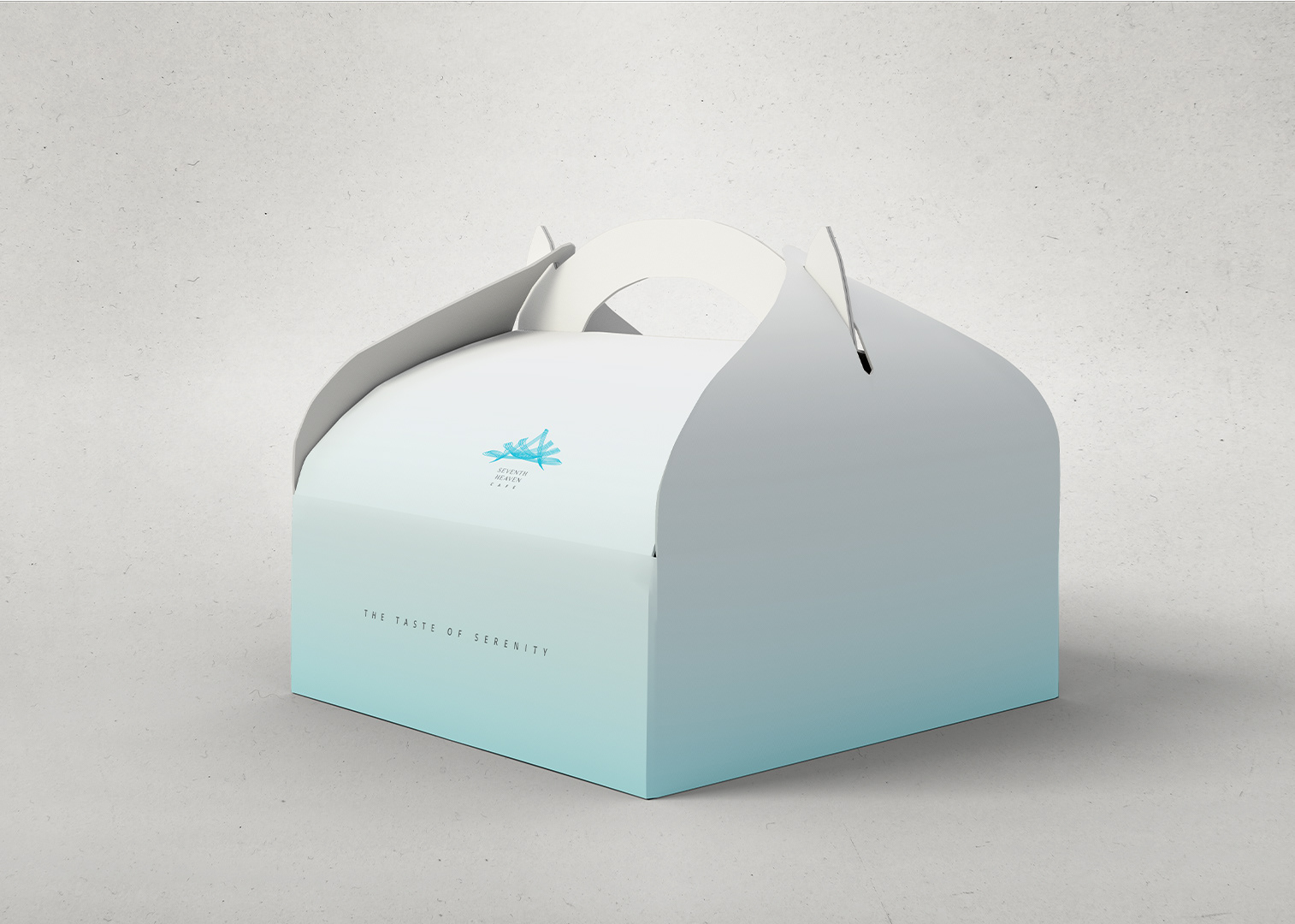
A gently upward fading gradient made from the brand colour palette. It represents the progression towards a state of mental clarity.
TYPOGRAPHY
OPEN SANS: Humanist sans-serif chosen for its open and embracing personality.
PHILOSOPHER: Serif typeface chosen for its unique swash-like serifs that captures the fluidity of vapour and smoke rising up into the air.
PHOTOGRAPHY GUIDELINES
Black and white imagery: Uncluttered and quiet, overlaid with graphic signature.
COLOUR IMAGERY: A neutral palette for the minimal aesthetic of the visual identity.
BRAND STATIONERY
OUTDOOR SIGNAGES, SOCIAL MEDIA
CAFE PACKAGING, OUTLET SIGNAGE
